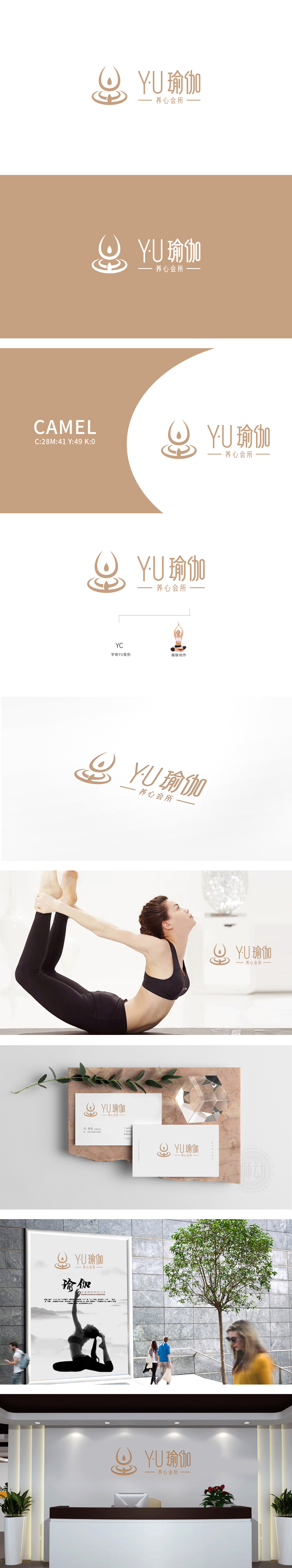
狮动设计采用”Y”的变形:“水滴状”线条,类似“Y”的竖笔延伸,象征纯净与滋养;“U”的变形:类似莲花座(代表能量的扩散,符合瑜伽“连接自我与宇宙”的理念);整体造型:水滴+莲花座的组合,既像瑜伽练习者“专注向内”的状态,又像“扎根生长”的生命,完美呼应“养心”的核心——从身体的稳定到心灵的沉淀。整体采用浅棕(米褐)+ 白**的柔和色调,传递温暖、平静、自然的氛围,既用直观的元素让观众快速识别行业,又用象征意义(水滴、莲花座)传递品牌的精神高度,是一套“有颜值、有内涵”的商业设计。
Lion design adopts the deformation of "Y": "water drop" line, similar to the vertical extension of "Y", symbolizing purity and nourishment; The deformation of "U": similar to the lotus (representing the diffusion of energy, in line with the concept of "connecting self and universe" in yoga); Overall modeling: the combination of water drop and lotus seat is not only like the yoga practitioner's state of "focusing inward" but also like the life of "rooting and growing", which perfectly echoes the core of "nourishing the heart"-from the stability of the body to the precipitation of the soul. The overall soft tone of light brown (beige) and white * * is adopted to convey a warm, calm and natural atmosphere.


扫码或拨打添加客服微信


