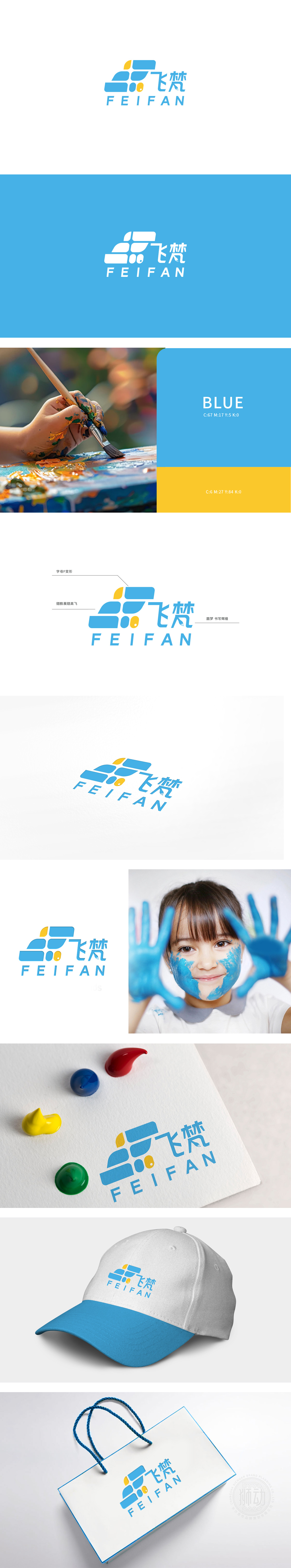
狮动设计以品牌首字母“F”为核心,通过抽象化处理,将两个“F”反向叠加、切割成多个蓝色彩块,巧妙组合成“翅膀展翅”**的形态——既有字母的识别性,又直观传递“飞”(FEI)的品牌关键词,完美呼应“飞梵”的名称。翅膀元素:强化“向上”的品牌情绪,传递出**“突破、成长、高飞”**的品牌价值观。翅膀中间的黄色小圆点+斜纹:模拟“眼睛”或“亮点”的形态,为冷静的蓝色调注入一丝活泼,仿佛在暗示“专注与希望”;,“用绘画讲品牌的故事”,传递“专业、可靠、冷静”品牌形象。
Lion design takes the brand initials "F" as the core, and through abstraction, two "F's" are reversely superimposed and cut into multiple blue color blocks, which are skillfully combined into the form of "wings spread" * *-which not only has the recognition of letters, but also intuitively conveys the brand keyword of "FEI", perfectly echoing the name of "Fei Fan". Wing element: strengthen the "upward" brand sentiment and convey the brand values of "breakthrough, growth and soaring". Yellow dot+twill in the middle of wings: simulating the shape of "eyes" or "bright spots".


扫码或拨打添加客服微信


