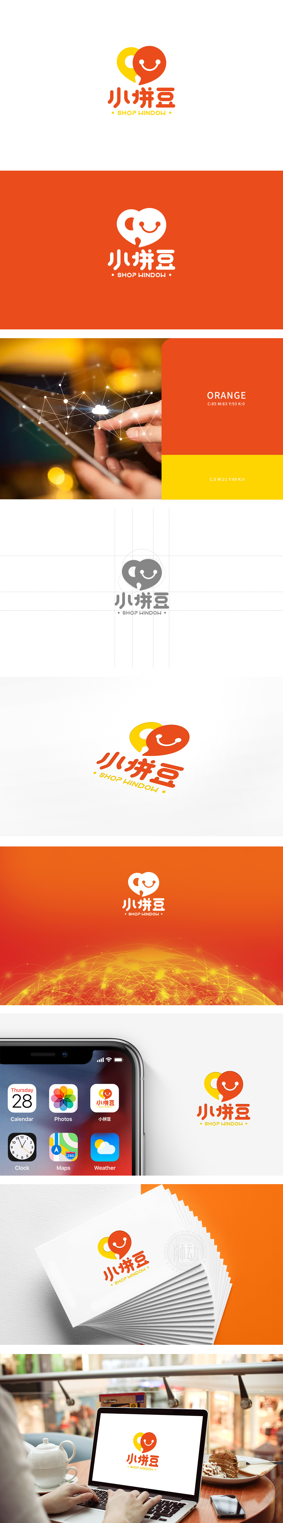
狮动设计以两个重叠的圆润图形为视觉中心,黄色心形:代表“温暖”“喜爱”,传递的“亲和感”,同时“心”的形状也能让人联想到“用心选品”;橙色对话框:既是“沟通”的符号,更妙的是它像一个“打开的橱窗”,直接点出“展示商品”的核心功能;对话框里的笑脸:用极简的两个圆点+弧线,把“快乐购物”的情绪拉满,瞬间让整个logo“活”了起来,也降低了用户对“电商平台”的距离感。图形的圆润感、文字的粗体+圆角设计,都在强化“柔和、可爱”的风格,亲和力满满。
Lion design takes two overlapping rounded figures as the visual center, with a yellow heart shape: representing "warmth", "love" and conveying "affinity", and the shape of the heart can also remind people of "choosing products with heart"; Orange dialog box: it is not only a symbol of "communication", but also an "open window", which directly points out the core function of "displaying goods"; Smiling face in the dialog box: With two minimalist dots+arcs, the mood of "happy shopping" is filled, which instantly makes the whole logo "live" and reduces the user's sense of distance from the "e-commerce platform".


扫码或拨打添加客服微信


