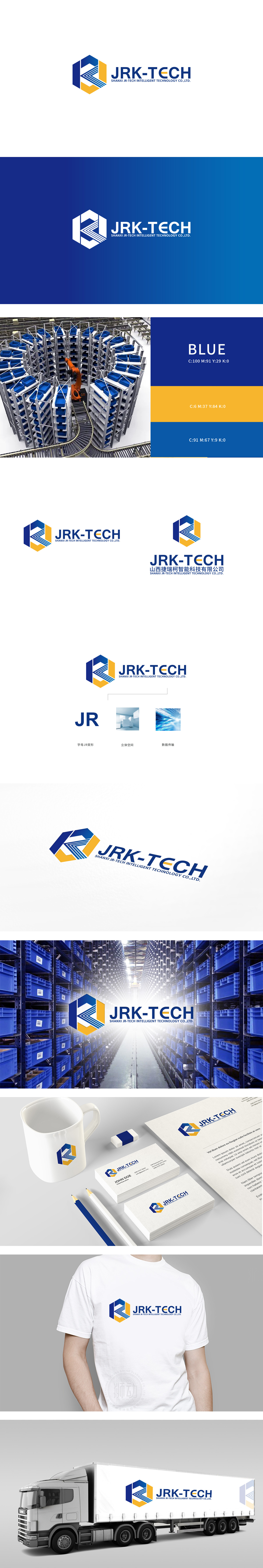
狮动设计将品牌缩写“JRK”具象为几何化的立体结构,辨识度高,强化“科技”的视觉联想:六边形外形形成一个立体空间,传递“科技赋能空间”的品牌定位。用“数字流”的视觉隐喻强化“科技驱动”的品牌形象。整体用“符号化图形”传递品牌身份,用“场景化元素”解释业务价值,最终形成“可识别、可联想、可记忆”的品牌视觉体系。
Lion Design takes the brand abbreviation "JRK" as a geometric three-dimensional structure with high recognition, which strengthens the visual association of "science and technology": the hexagonal shape forms a three-dimensional space and conveys the brand positioning of "science and technology empowerment space". Strengthen the brand image of "technology-driven" with the visual metaphor of "digital flow" As a whole, symbolic graphics are used to convey brand identity.


扫码或拨打添加客服微信


