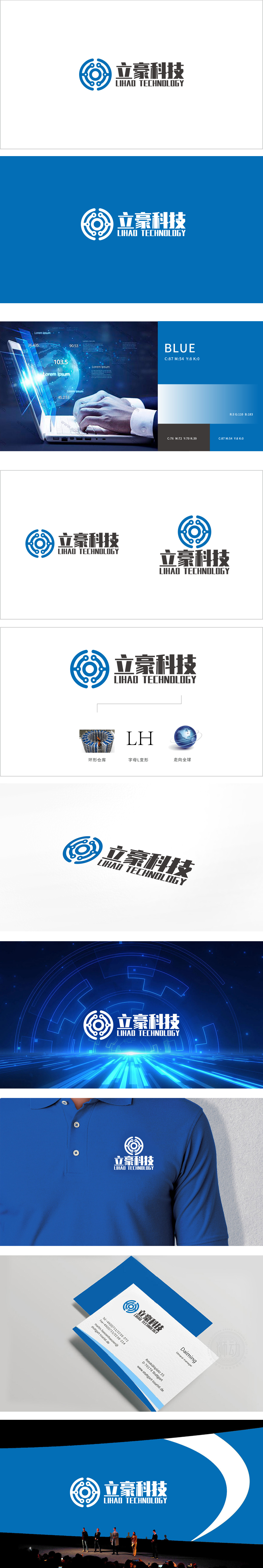
狮动设计以蓝色环形为核心,嵌套“圆心+放射状线条+外围点阵”的结构,环形:象征循环、高效;放射状线条:强化科技连接的属性;外围点阵:像“星星”或“传感器”,隐喻精准、感知。蓝色的理性与科技感,搭配粗体文字的稳重,传递“可靠的科技伙伴”形象;整体以“科技”为核心,以“业务”为根基,以“愿景”为牵引,通过符号化的LOGO、场景化的业务展示、情感化的愿景传递,构建了一个“专业、可信、有未来”的品牌形象。
Lion design takes the blue ring as the core, and the structure of "center+radial lines+peripheral lattice" is nested. The ring is a symbol of circulation and efficiency; Radial lines: strengthen the attribute of scientific and technological connection;Peripheral lattice: like "star" or "sensor", the metaphor is accurate and perceptive. Blue rationality and sense of science and technology, combined with the steadiness of bold text, convey the image of "reliable science.


扫码或拨打添加客服微信


