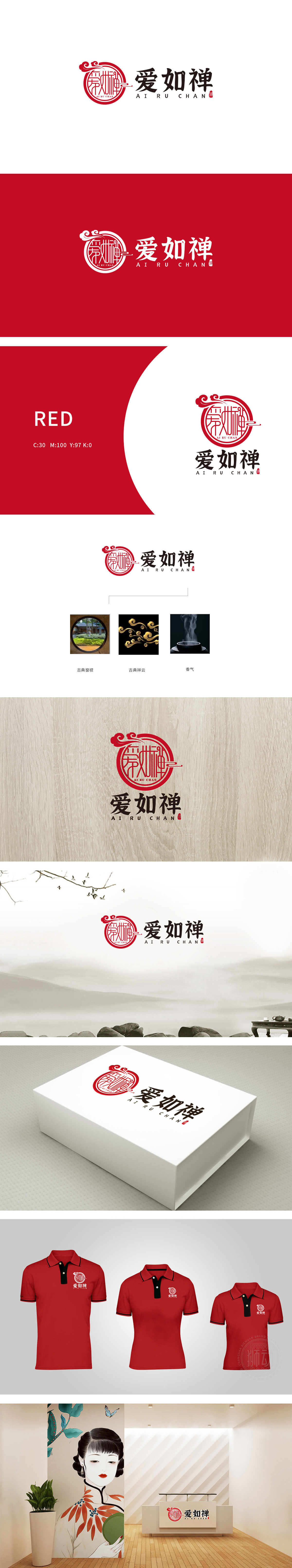
狮动设计以古典窗棂传递“在宁静中享受生活”的场景感;祥云是中国传统“吉祥图案”的代表,卷曲的线条象征“气流、运势”,自带“安康、顺遂”的寓意;书法字体“爱如禅”:书法是中国文化的“活化石”,笔画的顿挫、墨色的浓淡自带“文化底蕴”,“禅”字更是点睛之笔——禅意强调“平和、内省、与自然共生”,整体设计以“圆”为核心视觉锚点,代入窗棂的宁静、祥云的柔和、香气的舒缓,共同营造了“放松、安心”的情绪,“传统、可靠、禅意”的核心调性。
Lion design conveys the scene sense of "enjoying health in peace" with classical window lattice; Xiangyun is the representative of the traditional "auspicious pattern" in China. The curly lines symbolize "airflow and fortune" and carry the meaning of "well-being and smoothness". Calligraphy font "Love is like Zen": Calligraphy is the "living fossil" of China culture. The ups and downs of strokes and shades of ink bring their own "cultural heritage", and the word "Zen" is the finishing touch-Zen emphasizes "peace, introspection and symbiosis with nature". The overall design takes "circle" as the core visual anchor, which is substituted for the tranquility of the window lattice and the softness of Xiangyun.


扫码或拨打添加客服微信


