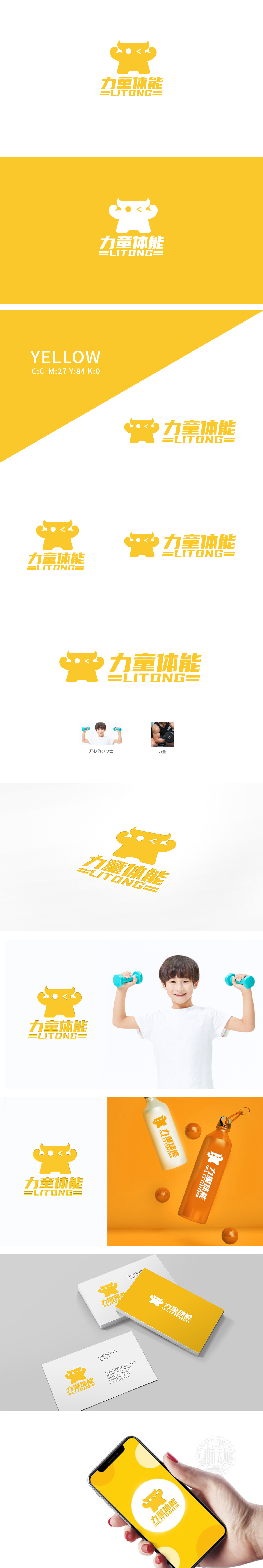
狮动设计采用黄色卡通形象:圆润的轮廓、夸张的“举臂”姿势、极简的面部,整体像个“可爱的小力士”。这种设计萌感、有活力、无距离感,瞬间让孩子产生“想靠近”的兴趣。色彩选择:主色调是明亮的黄色,能快速抓住注意力;搭配“力童体能”的金黄字体,强化“力量”感的同时,保持了童趣的温暖。字体设计,字体整体方正但边角圆润,既传递“力量”的核心,又不失去“儿童”的柔软感;整体形成了一条“形象→场景→目标”的闭环,让观众瞬间理解“力童体能”的核心——让孩子在快乐中获得力量。
Lion design adopts yellow cartoon images: rounded outline, exaggerated "arm-raising" posture and minimalist face, and looks like a "cute little lux" as a whole. This kind of design is cute, energetic and has no sense of distance, which instantly makes children have an interest in "wanting to be close". Color selection: the main color is bright yellow, which can quickly catch attention; With the golden font of "Li Tong Physical Fitness", it strengthens the sense of "strength" while maintaining the warmth of childlike interest. Font design, the whole font is square but the corners are round.


扫码或拨打添加客服微信


