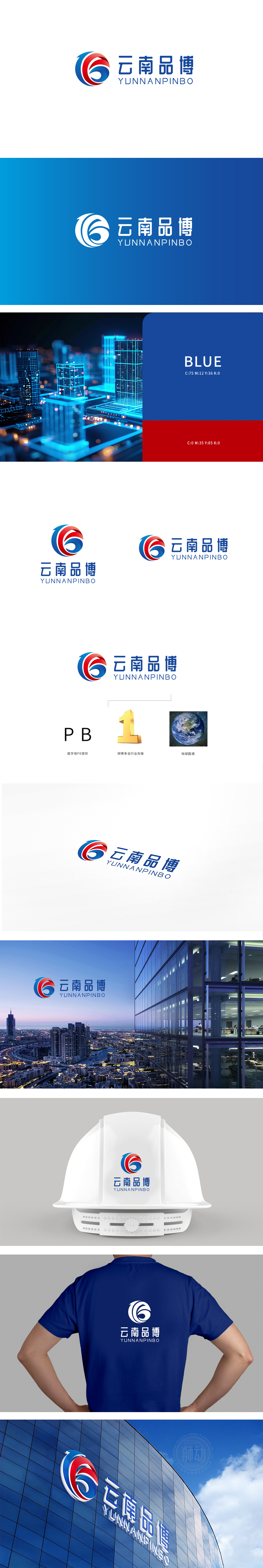
狮动设计采用首字母PB变形,作为品牌的“缩写符号,红蓝涡旋像建筑的“精神屋顶”,用流动的曲线勾勒出云南的地域包容与企业的成长动能;地球元素,则是品牌的“全球窗景”,像建筑中面向世界的落地窗,把“圆满”的追求延伸到更辽阔的格局。当这些“视觉建筑元素”被有机组合,一座“有故事、有态度、有温度”的品牌建筑便应运而生——它不仅好看,更像建筑一样“有逻辑、有支撑、有远方”,每一处设计都在诉说:好的品牌视觉,从来不是孤立的图形,而是用视觉语言搭建起的“品牌精神家园”。
Lion design uses the initials PB deformation as the "abbreviation symbol" of the brand, and the red and blue vortex is like the "spiritual roof" of the building, which outlines the regional tolerance of Yunnan and the growth momentum of enterprises with flowing curves; The earth element is the brand's "global window view", like the floor-to-ceiling windows facing the world in architecture, which extends the pursuit of "perfection" to a broader pattern. When these "visual architectural elements" are organically combined, a brand building with story.


扫码或拨打添加客服微信


