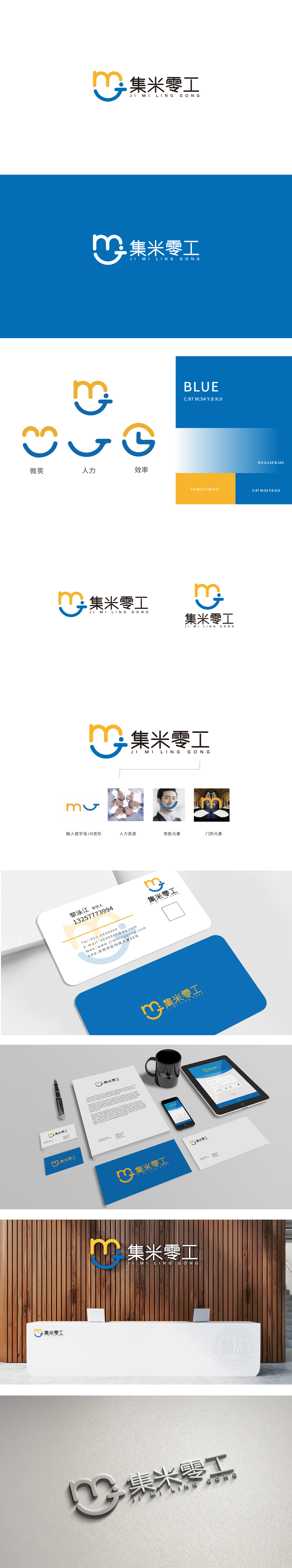
狮动设计通过首字母“JM”的隐形变形:蓝色曲线的“微笑弧度”与橙色“M”的“温暖感”结合,传递“集米零工是一个‘友好、可信赖’的平台”,减少用户的距离感。橙色(活力、积极)与蓝色(可靠、专业)的组合,既符合零工平台“充满机会”的调性,又传递了“值得信赖”的服务属性通过形态的叠加实现了“你中有我”: 门是“入口、机会”的符号,直接对应零工平台“连接劳动者与就业机会”的核心功能。整体设计采用“一形多义”的设计,从“碎片化符号”到“整体识别”,每一笔都服务于“业务本质”,传递了“专业、高效”的服务属性。
Lion Design combines the invisible deformation of the initial "JM" with the "smile radian" of the blue curve and the "warmth" of the orange "M" to convey that "collecting rice odd jobs is a friendly and reliable platform" and reduce the user's sense of distance. The combination of orange (energetic and positive) and blue (reliable and professional) not only conforms to the tonality of "full of opportunities" of the odd-job platform, but also conveys the service attribute of "trustworthy". Through the superposition of forms, "you have me" is realized: the door is the symbol of "entrance and opportunity", which directly corresponds to the core function of "connecting workers and employment opportunities" of the odd-job platform.


扫码或拨打添加客服微信


