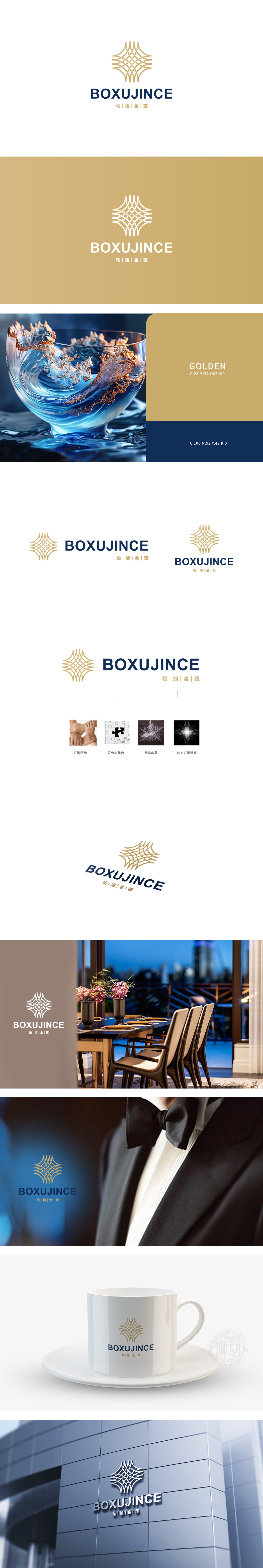
狮动设计将金色编织图案作为视觉核心,形态上:类似“星芒”,既像展开的地图,又像交织的资源网络(象征土地、资金、团队、客户的整合);金色(财富、高端)+ 深蓝色(专业、稳定)的组合,完美匹配地产行业“高价值、重信任”的属性——金色满足客户对“资产增值”的期待,深蓝色传递企业“专业可靠”的形象。通过符号化语言将抽象的“房地产开发/服务”转化为可感知的“信任、资源、成果、财富”,整体风格简洁大气,符合高端地产或产业地产的品牌调性。
Lion design takes the golden woven pattern as the visual core, which is similar to "Star Mountain" in form, both like an unfolded map and an interwoven resource network (symbolizing the integration of land, funds, teams and customers); The combination of gold (wealth, high-end) and dark blue (professionalism and stability) perfectly matches the attributes of "high value and trust" in the real estate industry-gold meets customers' expectations of "asset appreciation" and dark blue conveys the image of "professionalism and reliability" of the enterprise.


扫码或拨打添加客服微信


