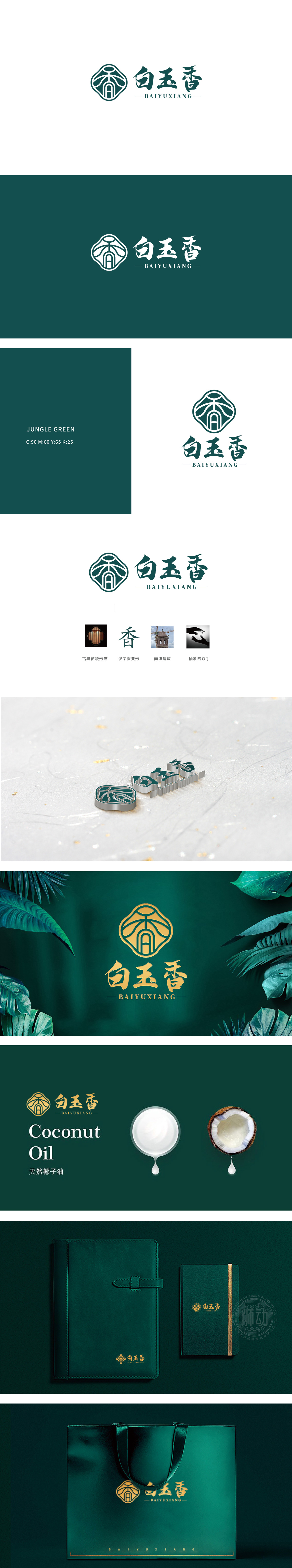
狮动设计将名称与核心意象:“白玉香”三字直接关联食品的视觉与嗅觉体验:“白玉”:象征“洁白、细腻、纯净”,传递“原料优质、工艺精细”的印象;“香”:食品的核心卖点之一,用书法字体强化“典雅、浓郁”的香气感知,将“食品”的品质、风味、工艺转化为可视化语言,精准对接消费者对“好吃、可靠、有故事”的食品认知:整体设计蕴涵“食品老字号”的文化底蕴,又符合现代消费者对“时尚、易识别”的需求,传递用古典工艺,做有香气、有温度的好食品。
Lion design directly relates the name and the core image: "white jade" to the visual and olfactory experience of food: "white jade" symbolizes "white, delicate and pure" and conveys the impression of "high quality raw materials and fine technology"; "Fragrance" is one of the core selling points of food. The calligraphy font is used to enhance the aroma perception of "elegance and richness", and the quality, flavor and technology of "food" are transformed into visual language.


扫码或拨打添加客服微信


