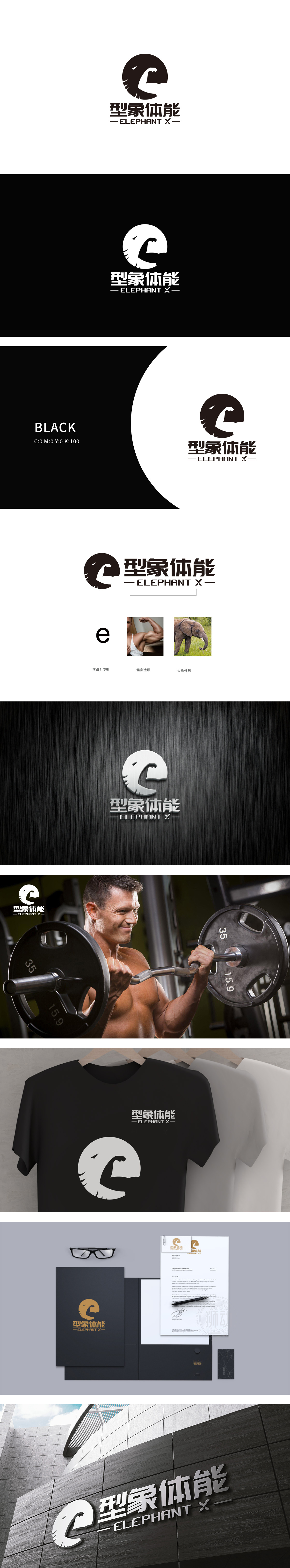
狮动设计以字母“e”变形:明确LOGO的字体设计源头,体现“从文字到图形”的创意转化;健身造型:通过男性展臂的肌肉线条,直观对应LOGO中“手臂弯举”的动态感,强化“力量训练”的属性;大象外形:真实大象的沉稳形象,赋予品牌“稳健、持久、力量”的联想。 三者形成“抽象符号→具象参考→概念联想”的闭环,让设计逻辑清晰可感。
Lion design is transformed with the letter "e": the source of font design of LOGO is clear, and the creative transformation from text to graphics is reflected; Fitness modeling: through the muscle lines of men's arm stretching, it intuitively corresponds to the dynamic sense of "arm bending" in LOGO, and strengthens the attribute of "strength training";Elephant shape: the calm image of the real elephant gives the brand the association of "stability, durability and strength".


扫码或拨打添加客服微信


