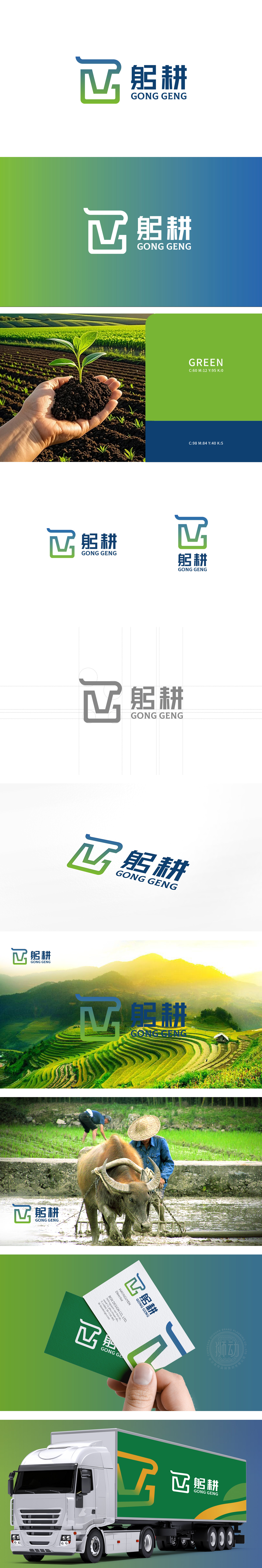
狮动设计采用“首字母变形+功能符号”的组合设计,既保留了品牌识别性,又暗藏农业的核心意象:字母“G”的变形:图形整体是“躬耕”首字母“G”的抽象化——蓝色曲线像犁头,绿色矩形+V型像农田的垄沟(土地被规整耕作的形态)。这种设计将“品牌名称”与“农业动作/场景”强绑定,让图形自带“耕种”的联想。V型与矩形的组合:绿色部分的V型(胜利、生长)嵌入矩形(土地、规整),既象征“农田里的生长力”,也暗含“通过规范耕作获得丰收”的逻辑,符合农业“一分耕耘一分收获”的底层逻辑。“躬耕”的蓝绿渐变完美贴合当代农业的两大趋势——生态可持续与科技赋能,整体用“稳重感”传递农业的“踏实性”,精准传递了“现代、生态、专注”的农业品牌形象。
Lion design adopts the combination design of "initial deformation+functional symbol", which not only retains the brand recognition, but also hides the core image of agriculture: the deformation of the letter "G": the whole figure is the abstraction of the initial "G" of "ploughing"-the blue curve is like a plow, and the green rectangle +V shape is like a furrow of farmland (the form of land being regularly cultivated). This design strongly binds "brand name" and "agricultural action/scene", so that the graphics have the association of "farming". Combination of V-shape and rectangle: The V-shape (victory and growth) of the green part is embedded in the rectangle (land and regularity), which not only symbolizes "the growth force in farmland".


扫码或拨打添加客服微信


