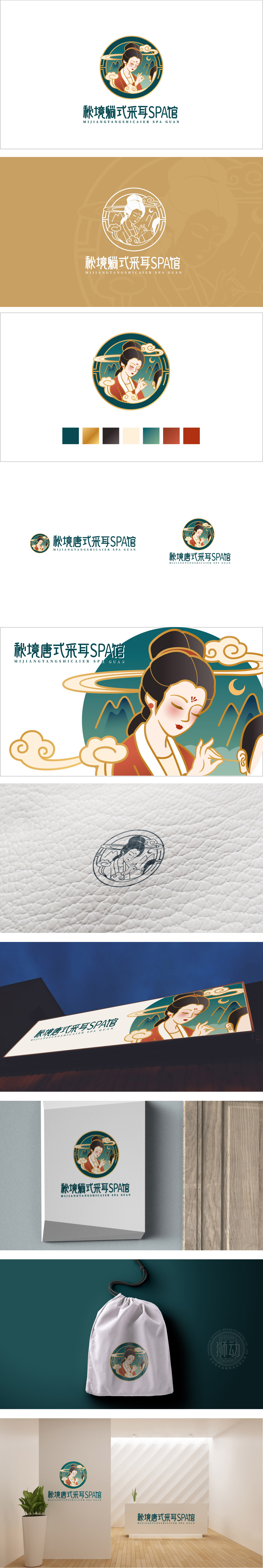
狮动设计用「唐韵符号」直接锚定品牌记忆,画中女子梳着唐代典型的「高髻」,穿着「襦裙」,右手轻扶耳部,指尖微微翘起,像是在模拟采耳的动作,用最直观的肢体语言暗示了“采耳”的服务内容,人物身后有淡墨色的「山水轮廓」和卷曲的「云纹」,加上圆形边框的包裹,像一扇“通往秘境的窗”,刚好呼应了“秘境”的品牌名,把“采耳”从“功能性服务”升维成“穿越唐式秘境的体验”;整体用唐式符号锚定品牌身份,用秘境氛围吸引目标客群,用平衡设计适应现代传播,整体色调偏沉稳但不沉闷,既保留了唐代的“富贵感”,又符合SPA馆“高端、雅致”的定位。暗示这是一家「有文化底蕴的高端采耳店」。
Lion design directly anchors the brand memory with the Tang rhyme symbol. In the painting, the woman wears a typical high bun in the Tang Dynasty, wears a skirt, gently supports her ears with her right hand, and her fingertips are slightly tilted, which seems to simulate the action of ear picking, suggesting the service content of ear picking with the most intuitive body language. There are light ink "landscape outline" and curly "clouds" behind the characters. entirety.The brand identity is anchored by Tang symbols, the target audience is attracted by secret atmosphere, and the modern communication is adapted by balanced design.


扫码或拨打添加客服微信


