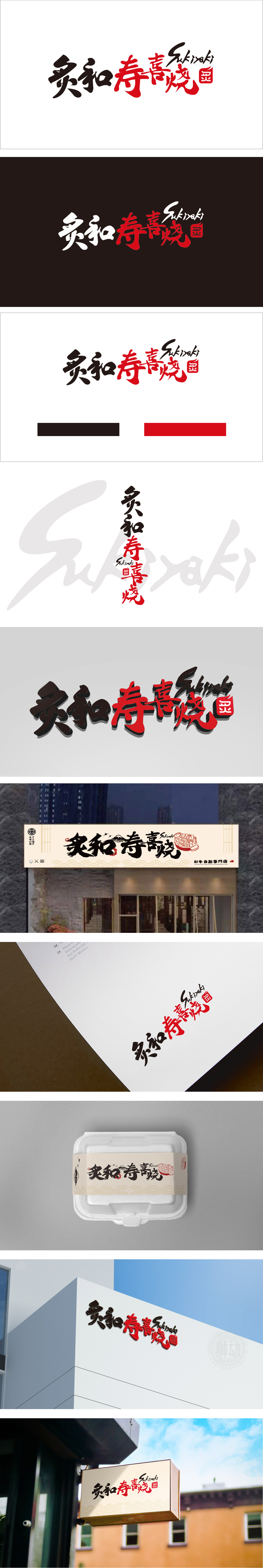
狮动设计将“炙和”二字用黑色行书,笔画连绵、笔锋劲健,保留了中国书法的韵味;“寿喜烧”用红色楷书,结构方正、色彩浓烈,形成“黑-红”对比,既突出了“寿喜烧”的核心品类,又符合日式餐饮“热闹、喜庆”的氛围。寿喜烧(すき焼き)是日本“国民料理”之一,代表“家庭团聚”“温暖治愈”的场景。整体设计用“红+黑”的配色、书法字体、红印等元素,共同营造了“围炉而坐、吃寿喜烧”的画面感,让消费者看到这个 logo 就能联想到“冒着热气的铁锅、鲜嫩的牛肉、甜辣的酱汁”,实现了“视觉→味觉→情感”的共鸣。
Lion design uses the word "harmony" in black running script, with continuous strokes and strong strokes, which retains the charm of China's calligraphy; "Shouxi Roast" is written in red regular script, with square structure and strong colors, forming a "black-red" contrast, which not only highlights the core category of "Shouxi Roast", but also conforms to the "lively and festive" atmosphere of Japanese catering. Sukiyaki (すき?き) is one of Japan's "national dishes", representing the scene of "family reunion" and "warm healing". The overall design uses "red+black" color matching, calligraphy font, red seal and other elements to create a picture sense of "sitting around the stove and eating birthday roast".


扫码或拨打添加客服微信


