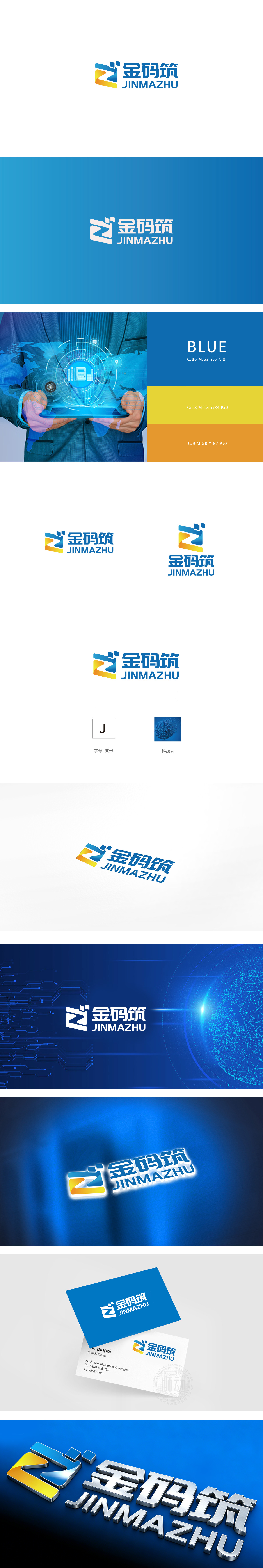
狮动设计采用"Z"字母的变形,图形整体呈倾斜的动态结构,传递"前进、突破"的科技感,符合"码筑"(代码构建、数据搭建)的动态属性;蓝黄配色:蓝色代表"科技、专业、可靠",黄色代表"活力、创新、警示",小方块:象征"代码块""数据单元"或"建筑砖块",直接关联"码筑"的业务本质(用代码/数据构建系统/产品),将抽象的"技术"转化为可感知的视觉符号。用极简的视觉语言,传递最核心的品牌信息。每一个线条、颜色、形状都服务于"科技构建"的品牌定位。
Lion Design adopts the deformation of "Z" letter * *, and the whole figure is in an inclined dynamic structure, which conveys the sense of "progress and breakthrough" and conforms to the dynamic attributes of "code building" (code building and data building). Color matching of blue and yellow: blue stands for "technology, professionalism and reliability", yellow stands for "vitality, innovation and warning", and small squares symbolize "code block", "data unit" or "building brick".


扫码或拨打添加客服微信


