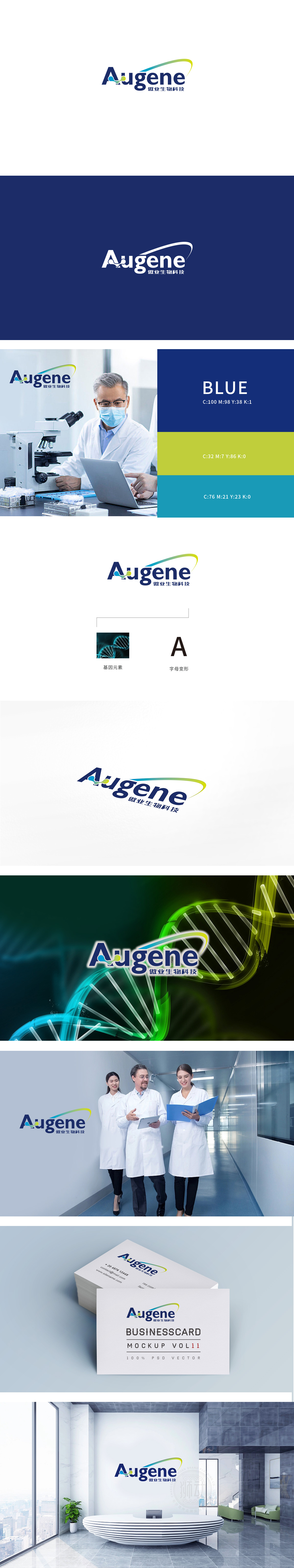
狮动设计通过「字母=品牌=行业」的连锁联想,把品牌标识变成了「基因医疗」的符号化代表。 这种「基因元素+品牌字母」的组合,相当于给品牌贴了个「行业标签」,看到「A」就想起「基因科技」,看到「DNA」就联想到「傲业生物」,用最低的认知成本建立了品牌与医疗服务的强绑定。用深海蓝(医疗行业的「信任色」),传递专业、可靠;中间的彩色渐变连接符(蓝→黄→绿)像一条「生命链条」,既模拟了基因序列的流动,又用黄(活力)、绿(健康)打破了医疗的严肃感,暗示「科技赋能生命」的品牌理念;整体设计将专业感与科技感的完美调和,让医疗服务「一眼懂」。
Through the chain association of "letter = brand = industry", Lion Design has turned the brand logo into a symbolic representative of "gene medical treatment". This combination of "gene elements+brand letters" is equivalent to putting an "industry label" on the brand. When you see "A", you will think of "gene technology", and when you see "DNA", you will think of "Aoye Bio", thus establishing a strong bond between the brand and medical services with the lowest cognitive cost. Use deep blue (the "trust color" of the medical industry) to deliver professionalism and reliability; The color gradient connector (blue → yellow → green) in the middle is like a "life chain".


扫码或拨打添加客服微信


