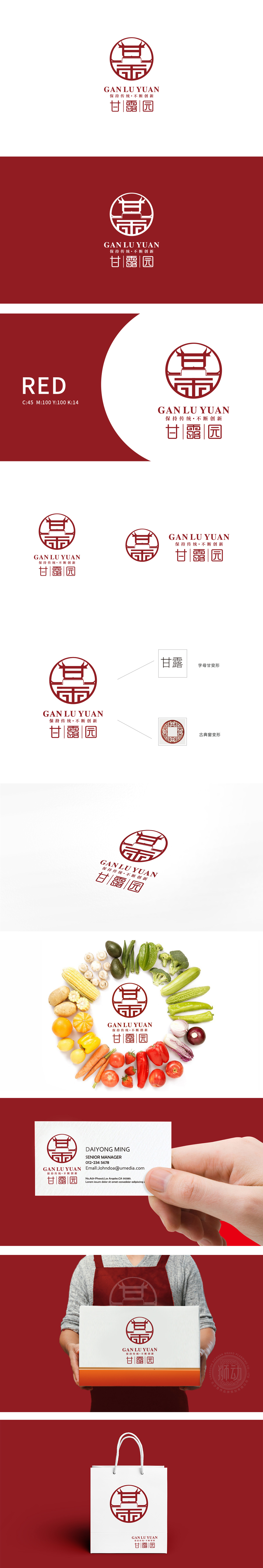
狮动设计采用“甘”“露”二字的变形——上方的“冖”像传统建筑的“屋顶”,中间的“一”连接上下,下方的“田”字直接对应“农耕/食材”,三者组合成一个类似“传统院落”的形态,既保留了汉字的辨识度,又强化了“扎根土地、传承农耕文化”的传统属性; 颜色采用中国红,红色是传统节日、喜庆的象征,传递“温暖、可靠”的品牌信任感,通过“视觉聚焦-符号共鸣-色彩联想”的三重逻辑,把“甘露园”的品牌属性(传统、创新、健康、全面)转化为可感知的视觉语言,既“好看”又“有内涵”。
Lion design adopts the variation of the characters "Gan" and "Lu" —— the upper character "Yi" is like the roof of a traditional building, the middle character "One" connects the upper and lower parts, and the lower character "Tian" directly corresponds to "farming/food". The three characters are combined into a form similar to "traditional courtyard", which not only retains the recognition of Chinese characters, but also strengthens it. The color is China red, which is a symbol of traditional festivals and celebrations, and conveys the brand trust of "warmth and reliability".


扫码或拨打添加客服微信


