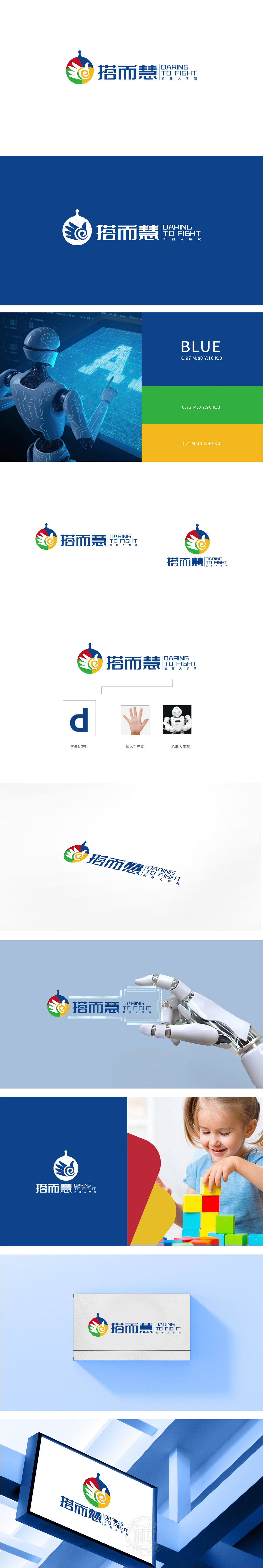
狮动设计通过四种颜色(红、蓝、绿、黄)与三类元素(螺旋、翅膀、天线)的叠加,构建了“科技+人文+成长”的复合象征体系: 红(热情/动力)、蓝(科技/专业)、绿(成长/希望)、黄(阳光/活力)均为高饱和度的三原色衍生色,符合青少年教育机构“活泼、积极、易识别”的视觉需求;螺旋纹(中心黄色):象征科技的迭代升级,也隐含“知识积累”的渐进性,契合机器人教育“从基础到高阶”的学习逻辑;翅膀(绿色/红色):采用抽象的羽毛形态,寓意创新突破,同时呼应“搭而慧”中“搭”的“搭建、突破”内涵;“搭”(搭建、协作)、“而”(连接、递进)、“慧”(智慧、创新)三字组合,直接点出学院“通过搭建机器人培养智慧”的教育理念;用科技赋能成长,让青少年敢于创新”的核心理念。
Lion Design has built a composite symbol system of "science and technology+humanity+growth" through the superposition of four colors (red, blue, green and yellow) and three elements (spiral, wings and antenna):Red (enthusiasm/motivation), blue (science/technology/specialty), green (growth/hope) and yellow (sunshine/vitality) are all derived colors of three primary colors with high saturation, which meet the visual needs of "liveliness, positivity and easy recognition" of youth education institutions. Spiral pattern (yellow in the center): it symbolizes the iterative upgrade of science and technology, and also implies the gradual nature of "knowledge accumulation", which is in line with the learning logic of "from basic to advanced" in robot education; Wings (green/red): the abstract feather shape is adopted.


扫码或拨打添加客服微信


