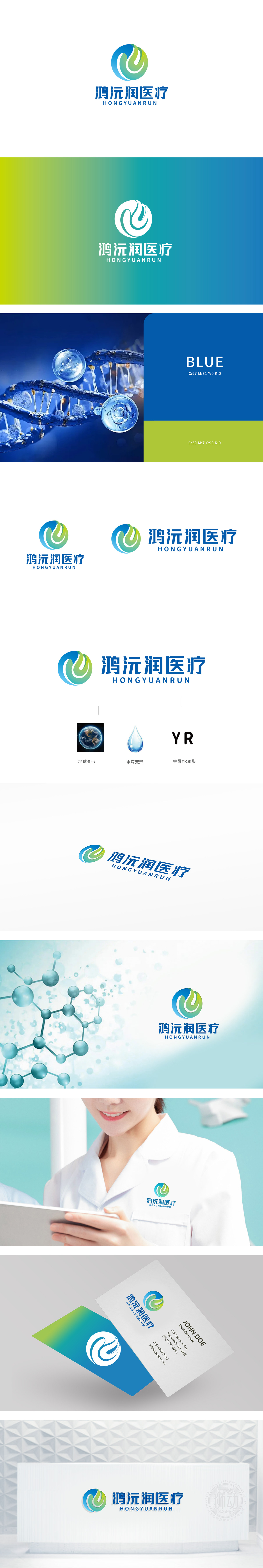
狮动设计采用母YR变形:品牌基因的隐性植入创作,通过地球的简化外形,呼应“鸿”字的“广阔”之意,传递品牌“覆盖广泛、服务全球”的格局;蓝色是主色,同时也是医疗行业的“信任色”,暗示品牌对“生命平等、普惠医疗”的追求,水滴变形:滋润与治愈的温度,水滴是“生命之源”的象征,传递医疗行业“治愈、关怀、滋养生命”的核心价值,整体LOGO将地球、水滴、字母YR三大元素的有机变形与叠加,,传递品牌“严谨、值得信赖”的专业形象。
Lion Design adopts the parent YR deformation: the recessive implantation of brand genes, which echoes the "vastness" meaning of the word "Hong" through the simplified shape of the earth and conveys the pattern of brand "covering a wide range and serving the world"; Blue is the main color, and it is also the "trust color" of the medical industry, which implies the brand's pursuit of "life equality and universal medical care". Water droplets are deformed: the temperature of moistening and healing. Water droplets are the symbol of "the source of life" and convey the core values of "healing, caring and nourishing life" in the medical industry.


扫码或拨打添加客服微信


