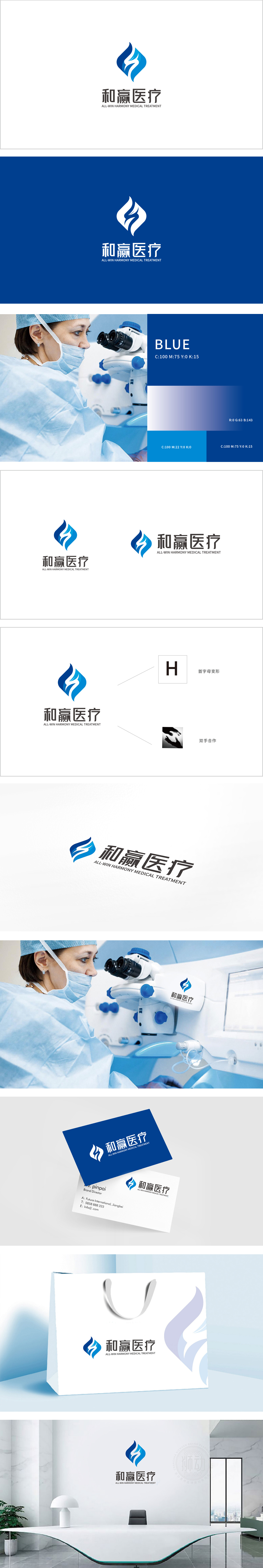
狮动设计以“H”(品牌英文“HARMONY”的首字母)为骨架,通过菱形轮廓与内部流动线条的组合,将“H”简化为更具视觉张力的符号,双手合作的具象呼应,将“合作”从具象的手形升维为更简洁的视觉语言,同时传递“和谐共赢”的品牌理念,菱形轮廓类似“盾牌”,隐含“保护”“可靠”的医疗属性。整体通过“首字母变形”“双手合作”的符号组合,将“和赢”(和谐共赢)的品牌理念转化为可视觉化的语言,将品牌的核心价值(和、赢、医疗)完美融合。
Lion design takes "H" (the initial letter of brand English "HARMONY") as the skeleton, and simplifies "H" into a symbol with more visual tension through the combination of diamond outline and internal flowing lines, and the cooperation of both hands echoes figuratively, upgrading "cooperation" from a figurative hand shape to a more concise visual language, while conveying the brand concept of "harmony and win-win". The diamond outline is similar to "shield". As a whole, the brand concept of "harmony and win-win" (harmony and win-win) is transformed into a visual language through the symbol combination of "initials deformation" and "hands cooperation".


扫码或拨打添加客服微信


