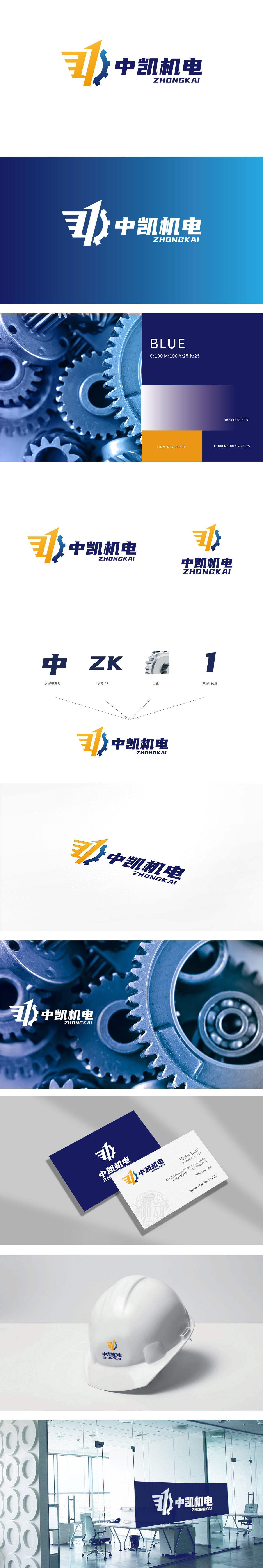
狮动设计通过汉字“中”变形: 保留“中”字的方正结构强化“中国品牌”的厚重感,字母“ZK”: 形成“汉字-字母”的呼应,暗示品牌的“国际化”兼容。齿轮: 机电行业的核心视觉符号,图中采用金属质感+半剖视角,传递“精密制造”的细节;数字“1”变形:符合“稳重领先”的品牌调性,整体设计 既满足了“行业识别”的基础需求,又通过“符号故事”传递了品牌的独特性。
Lion Design strengthens the sense of "China brand" by changing the Chinese character "Zhong", and the letter "ZK" forms the echo of "Chinese character-letter", which implies the internationalization compatibility of the brand. Gear: the core visual symbol of the electromechanical industry. In the drawing, metal texture and half-section perspective are adopted to convey the details of "precision manufacturing"; The number "1" is deformed: it conforms to the brand tonality of "steady and leading", and the overall design not only meets the basic needs of "industry identification".


扫码或拨打添加客服微信


