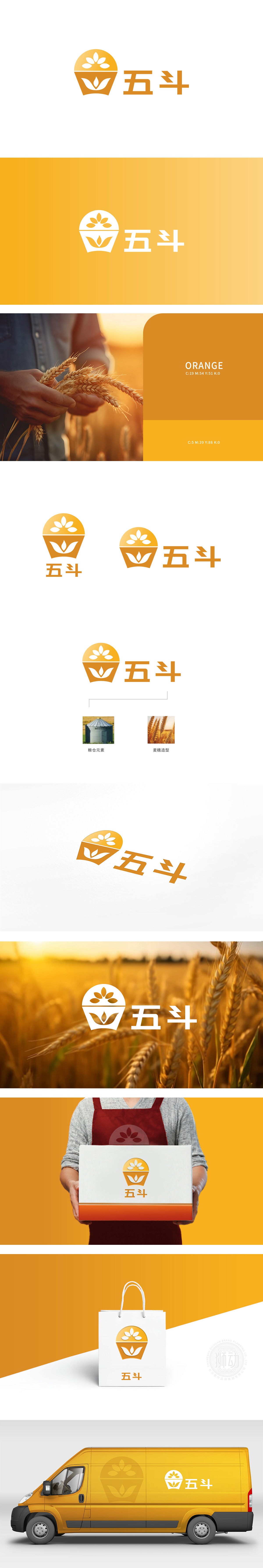
狮动设计通过“容器+作物”的组合,直接关联农牧行业的核心——“种植-收获”:圆形+花瓣状图案。圆形象征“太阳”,花瓣是麦芒/稻穗的抽象简化,既保留了农作物的辨识度,又通过几何化处理让图形更现代、简洁。五”字:笔画方正,重心稳定,符合“农牧”行业“扎实、可靠”的形象;斗是农牧行业的经典符号(代表收获、计量),强化“五斗”名称与“农牧”主题的关联。整体图形像一个“装满丰收果实的容器”,直观传达“农牧=种植+收获”的行业本质,符合农牧行业“自然、踏实”的调性。
Through the combination of "container+crop", the lion design is directly related to the core of agriculture and animal husbandry industry-"planting-harvesting": circle+petal pattern. The circle symbolizes "the sun", and the petals are the abstract simplification of wheat awn/rice ear, which not only retains the recognition of crops, but also makes the graphics more modern and concise through geometric processing. Five "characters: the strokes are square and the center of gravity is stable, which conforms to the image of" solid and reliable "in the" agriculture and animal husbandry "industry; Dou is a classic symbol of agriculture and animal husbandry (representing harvest and measurement).


扫码或拨打添加客服微信


