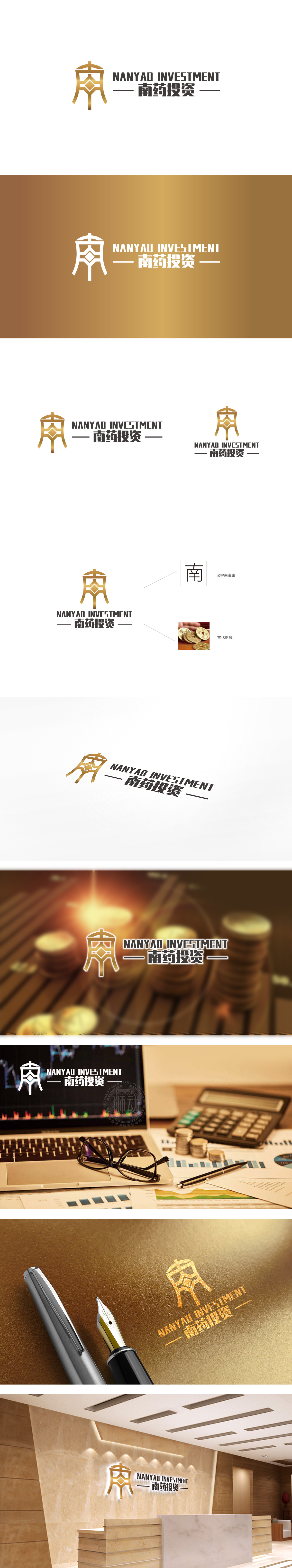
狮动设计采用“南”字的具象化变形,同时融入了传统器物的稳重感,既强化了“南药”的本土身份,又通过对称、方正的造型传递金融机构的“稳”字诀。中间的菱形钻石符号是点睛之笔:钻石的“坚硬、永恒、珍贵”属性,完美对应金融财务中的资产增值、价值稳定需求,同时菱形的几何感也增强了LOGO的现代感,平衡了传统元素可能带来的厚重感。金融领域的“黄金色”,象征财富、高端、信任,既符合“投资”的价值导向,也提升了品牌的质感与辨识度;整体通过符号隐喻、色彩语言与行业属性的精准结合,很好地传递了金融机构所需的核心形象——稳健、专业、本土扎根与价值增长。
Lion design adopts the figurative deformation of the word "Nan" and incorporates the sense of stability of traditional utensils, which not only strengthens the local identity of "Nan Yao", but also conveys the word "stability" of financial institutions through symmetrical and square modeling. The diamond symbol in the middle is the crowning touch: the "hard, eternal and precious" attribute of diamond perfectly corresponds to the needs of asset appreciation and value stability in financial affairs, and the geometric sense of diamond also enhances the modernity of LOGO and balances the heavy feeling that traditional elements may bring.


扫码或拨打添加客服微信


