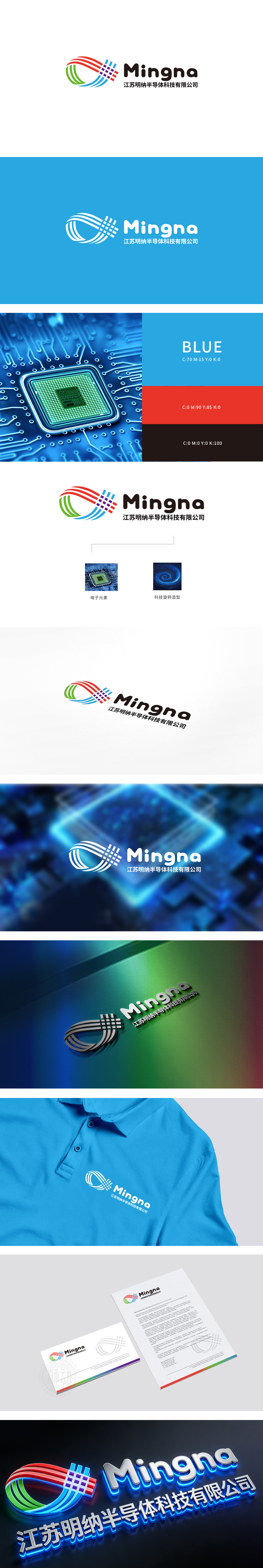
狮动设计采用曲线组(绿、蓝、红),绿色、蓝色、红色的曲线呈“环绕+穿透”结构,既象征半导体技术“连接、传导”的核心功能,又用动态的曲线打破科技感的生硬,传递“活力与创新”的品牌气质。曲线交叉处的紫色格子是点睛之笔——格子是半导体芯片的“视觉图腾”,直接点出品牌“半导体科技”的行业属性。整体用极简的图形讲清楚了“我们是做半导体技术的,且能实现高效的信号/电流传导”。实现了“科技感”与“温度感”的平衡——既传递了半导体企业“精密、专业”的技术形象,又暗示品牌“有活力、敢创新”的企业性格。
Lion Motion design adopts curve groups (green, blue and red), and the curves of green, blue and red are in a "surrounding+penetrating" structure, which not only symbolizes the core functions of semiconductor technology "connection and conduction", but also breaks the rigidity of scientific and technological sense with dynamic curves and conveys the brand temperament of "vitality and innovation". The purple grid at the intersection of curves is the finishing touch-the grid is the "visual totem" of semiconductor chips.


扫码或拨打添加客服微信


