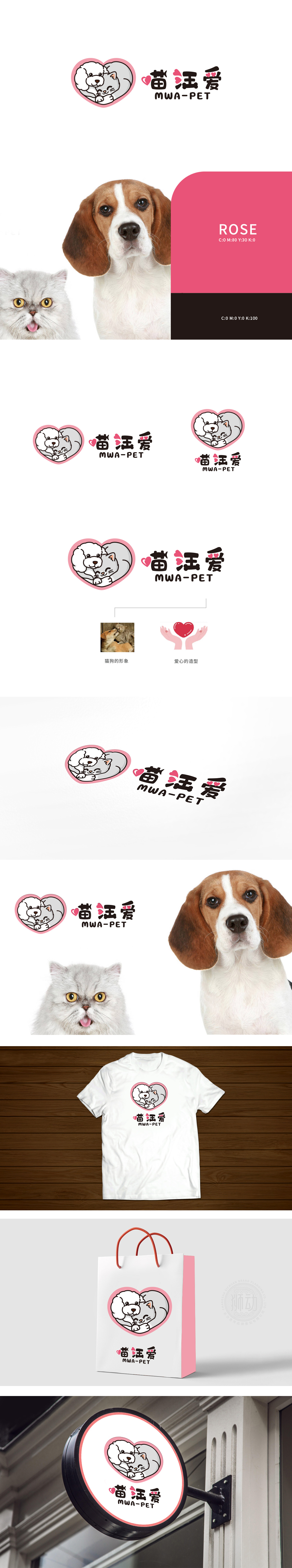
狮动设计用“爱与陪伴”击中宠物主人的情感痛点,心形内的猫狗相拥场景:卷毛狗温柔环绕、猫蜷缩在怀中闭眼的细节,模拟了宠物主人心中“理想的宠物相处模式”——和谐、温暖、彼此陪伴;“喵汪”直接点出服务对象(猫+狗,覆盖主流宠物群体)用“软萌+温暖”建立“可信又亲切”的品牌形象,粉色:粉色自带“温柔、可爱”属性,中性色则平衡了粉色的甜腻,让整体不显得轻浮,符合“宠物食品需要的安全感”;LOGOI用“爱”做内核,用“萌”做外壳,用“场景”做连接,完美匹配了宠物食品品牌的定位。
Lion design hits the emotional pain points of pet owners with "love and companionship", and the heart-shaped scene of cats and dogs embracing each other: the details of poodle gently surrounding and cat curled up in his arms and closing his eyes, simulates the "ideal pet getting along mode" in pet owners' hearts-harmony, warmth and companionship; "Meow Wang" directly points out the clients (cats+dogs, covering the mainstream pet groups) and establishes a "credible and friendly" brand image with "softness+warmth". Pink: pink has its own "tenderness and cuteness" attribute.


扫码或拨打添加客服微信


