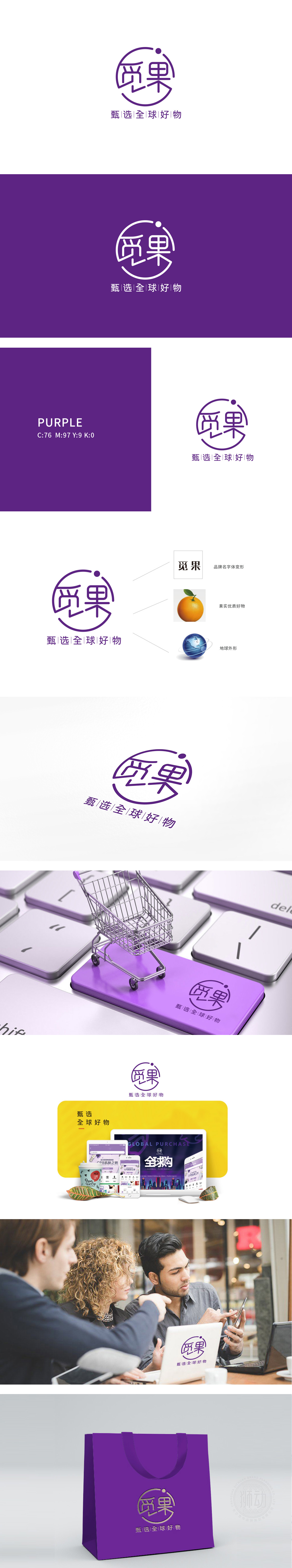
狮动设计采用「字体变形+圆形环绕」的设计,巧妙融合了「觅」(寻找)、「果」(好物)、「全球」(包容)三大关键词:「觅」字的撇画被简化为「探索的箭头」,暗合「甄选」的动作(像在全球范围内「寻找」好东西);「果」字用了方正的结构,搭配圆润的转角,既保留了「果实」的扎实感(优质商品),又符合现代审美(简洁易识别)。圆形环绕:整个LOGO被一个半闭合的圆形包裹,既像「放大镜」(聚焦好货),又像「星球轨道」(呼应全球定位),同时圆形的包容性传递出平台「涵盖各类好物」的综合性。整体用极简元素构建了强记忆点,每一处细节都精准呼应了平台「甄选全球优质好物」的核心定位。
Lion design adopts the design of "font deformation+circle surrounding", which skillfully combines three key words: seeking (seeking), fruit (good thing) and global (tolerance):The sketch of the word "seek" is simplified as "the arrow of exploration", which coincides with the action of "selecting" (like "finding" good things on a global scale); The word "fruit" uses a square structure with rounded corners, which not only retains the solid feeling of "fruit" (high-quality goods), but also conforms to modern aesthetics (concise and easy to identify). Circle Surrounding: The whole LOGO is wrapped in a semi-closed circle, which is like a magnifying glass.


扫码或拨打添加客服微信


