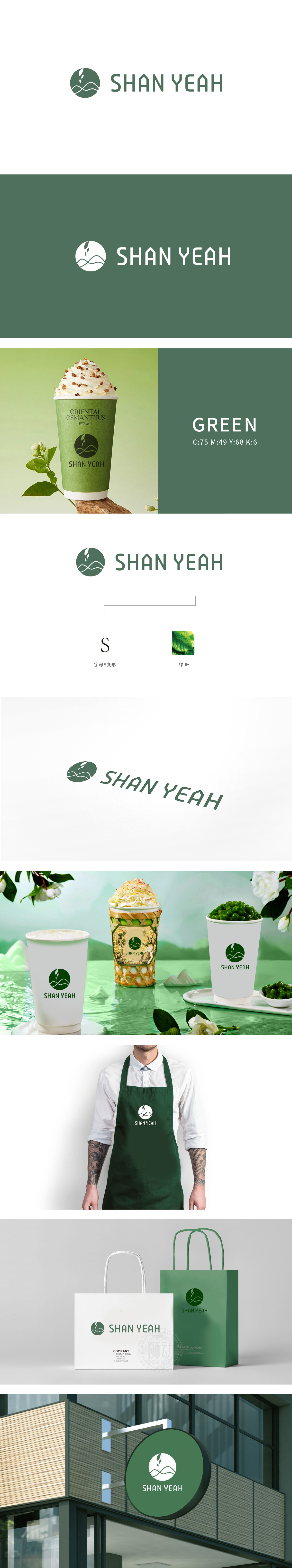
狮动设计logo里藏着“山+茶”的密码:绿色圆形中的波浪线是山的简化,上方的小嫩叶是茶芽的抽象,形成“logo→图片→品牌”的视觉链;色调统一到“能闻出茶香”:从logo全用“自然绿”贯穿,这种色调自带“新鲜、健康”的心理暗示,像一杯刚做好的抹茶奶茶,看着就清爽;整体设计把抽象的设计变成“一看就懂”的语言,让消费者瞬间get“我们的奶茶,原料来自山,核心是茶叶”的品牌主张。
The password of "mountain+tea" is hidden in the logo of the lion design: the wavy line in the green circle is the simplification of the mountain, and the small tender leaf above is the abstraction of the tea bud, forming a visual chain of "logo→ picture → brand"; The color tone is unified to "can smell the fragrance of tea": from the logo, "natural green" runs through, and this color tone has its own psychological hint of "fresh and healthy", like a cup of freshly made matcha milk tea.


扫码或拨打添加客服微信


