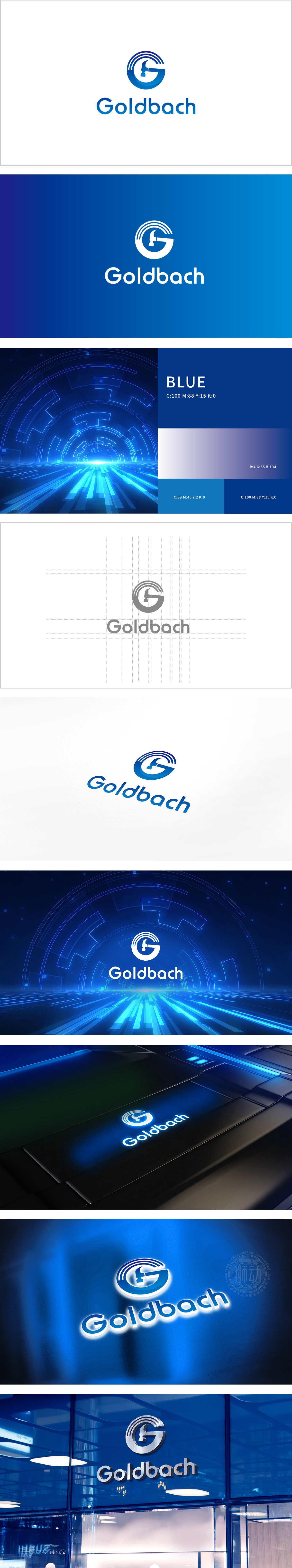
狮动设计将字母“G”与锤子、环形线条的组合,三者互为补充,形成强记忆点:字母“G”:作为品牌的视觉锚点,采用闭合式结构,给人稳定、可靠的感觉;锤子符号:嵌入“G”的内部,是设计的点睛之笔。关联“工艺、打磨、品质”——工匠精神”,环形线条:对应互联网行业的“网络、连接、生态”,暗示品牌的“长期主义”,整体传递了最核心的品牌信息(科技、可靠、连接、创新)品牌形象。
Lion design combines the letter "G" with the hammer and circular line, which complement each other and form a strong memory point: the letter "G": as the visual anchor of the brand, it adopts a closed structure, giving people a stable and reliable feeling; Hammer symbol: embedded in the "G", it is the finishing touch of the design. Associated with "craftsmanship, polishing and quality"-craftsman spirit, circular line: corresponding to "network, connection and ecology" of Internet industry, implying brand's "long-term" and conveying the core brand information (technology, reliability, connection and innovation) brand image as a whole.


扫码或拨打添加客服微信


