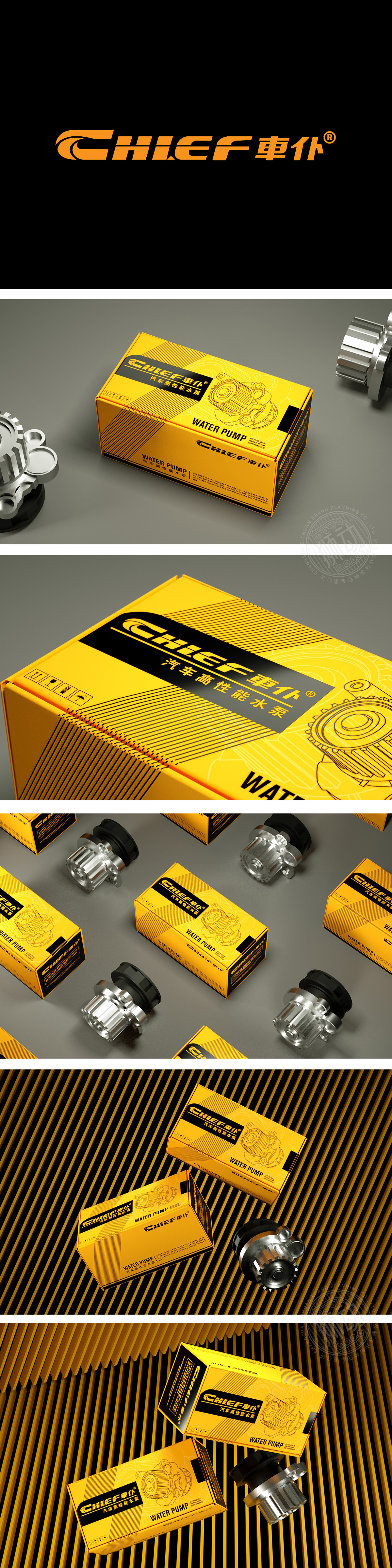
狮动设计用高饱和度对比打造“记忆点+专业感”,主色调选用亮黄色,高饱和度能在第一时间从货架/宣传物料中脱颖而出;辅以黑色作为辅助色,形成“黄黑撞色”的强烈对比,既平衡了黄色的跳跃感,又强化了“工业级专业”的属性。通过金属拉丝+橡胶密封件的细节刻画,直接展示产品的“高品质质感”。“功能优先、审美辅助、品牌贯穿”的设计逻辑,正是专业设计能力的核心,让设计成为“产品与用户之间的沟通桥梁”。
Lion design uses high saturation contrast to create "memory point+professionalism", and the main color is bright yellow, which can stand out from the shelves/promotional materials in the first time; With black as an auxiliary color, it forms a strong contrast between "yellow and black", which not only balances the jumping feeling of yellow, but also strengthens the attribute of "industrial specialty". Through the detailed description of metal wire drawing and rubber seal, the "high quality texture" of the product is directly displayed. The design logic of "functional priority.


扫码或拨打添加客服微信


