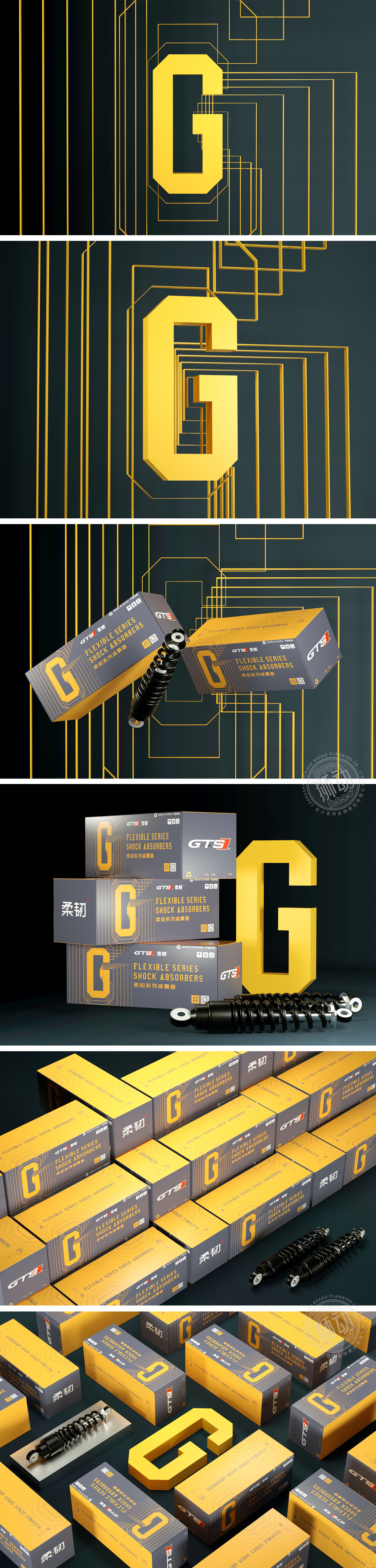
狮动设计通过“工业感与活力的平衡”,精准传递“可靠、科技、专业”的产品属性,同时强化品牌记忆点。巨型黄色“G”是整个设计的“视觉锚点”——它既是品牌“GTS”的首字母,更巧妙模拟了减震器的核心结构(中间的缺口对应减震器的活塞筒,线条延伸模拟液压管路)。这种“符号即产品”的设计,让消费者无需阅读文字,就能快速联想到“减震器”的功能,极大降低了认知成本。“深灰+亮黄”的工业感平衡:通过“强符号+高对比”,快速识别品牌与产品,用最直接的视觉语言,让产品自己说话。
Lion design accurately conveys the product attributes of "reliability, technology and professionalism" through * * "the balance between industrial sense and vitality", and at the same time strengthens the brand memory. The giant yellow "G" is the "visual anchor" of the whole design-it is not only the initials of the brand "GTS", but also cleverly simulates the core structure of the shock absorber (the gap in the middle corresponds to the piston tube of the shock absorber, and the lines extend to simulate the hydraulic pipeline). This design of "symbol is product" allows consumers to quickly associate the function of "shock absorber" without reading words.


扫码或拨打添加客服微信


