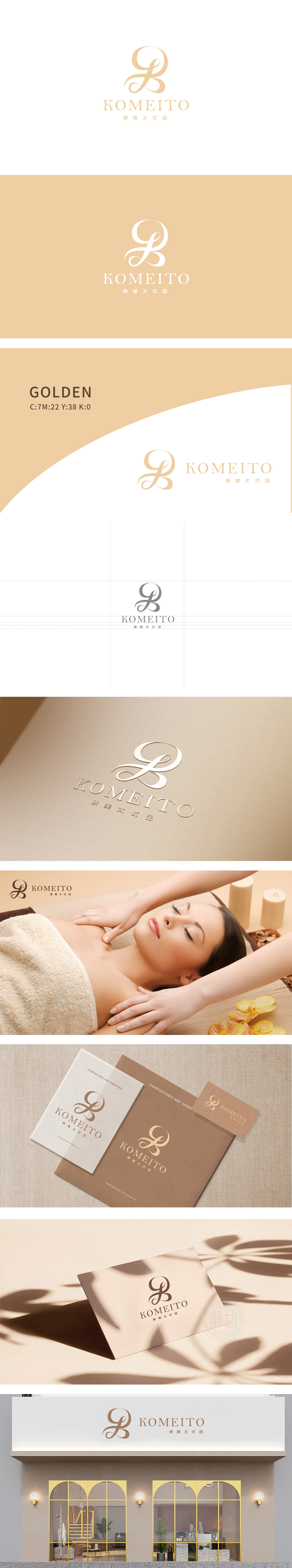
狮动设计以流畅的曲线为核心,整体呈现出**“K”与“M”字母的融合形态**。曲线无尖锐棱角,流动感极强,仿佛女性柔滑的轮廓或护肤品的质感。流畅的曲线是设计的灵魂,既模拟了皮肤的光滑质感(呼),又隐约呈现出女性侧脸的轮廓。曲线的“流动感”更传递出“舒适、放松”的体验感,符合美容服务“身心愉悦”的追求。金色自带“高贵、质感”属性,契合“优品”的品牌定位,整体风格以优雅、高端、柔和为核心,完美契合美容行业的品牌调性。通过“形态-颜色-字体”的三位一体设计,完美诠释了美容品牌的核心价值——用专业与质感,传递“美”的体验。
Lion design takes the smooth curve as the core, and the whole presents the fusion form of * * "K" and "M" letters. The curve has no sharp edges and corners, and it has a strong sense of fluidity, like the smooth outline of women or the texture of skin care products. Smooth curve is the soul of design, which not only simulates the smooth texture of skin, but also vaguely presents the outline of female side face. The "flowing feeling" of the curve conveys the feeling of "comfort and relaxation", which is in line with the pursuit of "physical and mental pleasure" in beauty service. Gold has its own "noble, texture" attribute, which fits the brand positioning of "excellent products".


扫码或拨打添加客服微信


