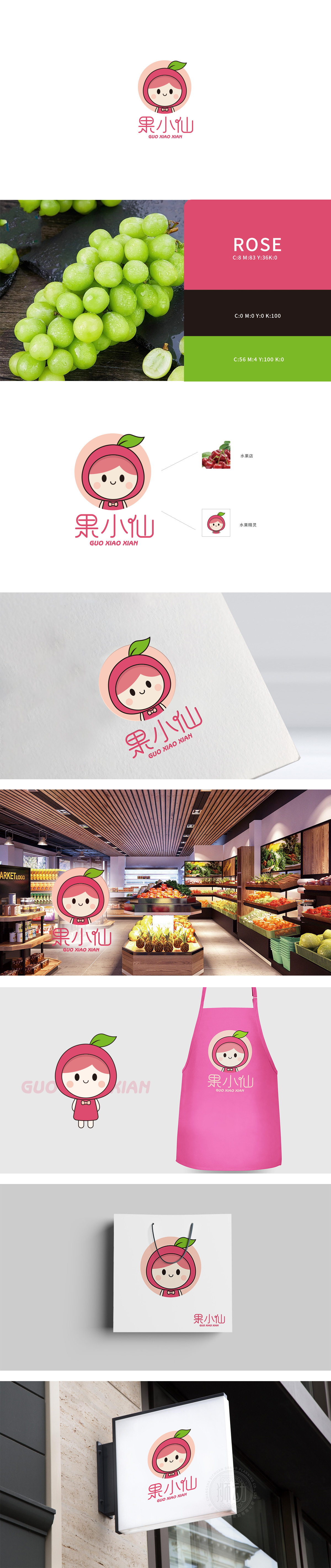
狮动设计把水果元素玩出了可爱感与记忆点兼具的巧思,每一处细节都藏着对「水果」主题的精准拆解和拟人化转化,难怪会让人觉得设计很有灵气~:从「苹果」到「小仙」的巧妙过渡,是把果实「变」成了卡通人物的帽子,既保留了水果的核心特征,又通过「帽子」这个日常物品赋予了形象「人格化」属性。用柔和感传递「新鲜与治愈」,主色调选了粉中带点奶油感的浅粉色,像咬开一口的水蜜桃或红富士苹果的果皮色,自带「新鲜、甜美」的视觉暗示,又让形象更有立体感。加上脸颊的浅粉腮红、脖子上的蝴蝶结,整个颜色体系都在强化「水果的甜」和「小仙的萌」。把水果店的「核心需求」(吸引客流、传递新鲜、让顾客记住),变成了一个「会笑、会让人想亲近的小娃娃」。
Lion design plays the fruit element with both cuteness and memory, and every detail hides the precise disassembly and personification of the theme of "fruit". No wonder people feel that the design is very aura ~: The ingenious transition from "apple" to "fairy" is to "change" the fruit into a cartoon character's hat, which not only retains the core characteristics of the fruit, but also gives it through the daily object of "hat" It conveys "freshness and healing" with a soft feeling. The main color is light pink with a little creamy feeling, like the peel color of a bitten peach or a red Fuji apple, which has a visual hint of "freshness and sweetness" and makes the image more three-dimensional.Coupled with the light pink blush on the cheeks and the bow on the neck, the whole color system is strengthening the "sweetness of fruit" and "the sprout of the little fairy".


扫码或拨打添加客服微信


