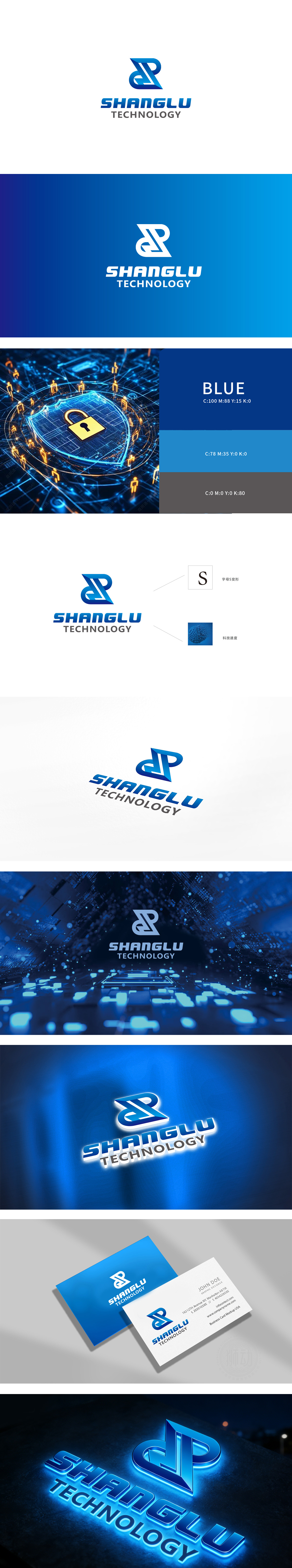
狮动设计采用「S」形折线,通过渐变蓝色营造出三维空间感,视觉上有「流动」「连接」的意象;曲线的圆润感与折线的锋利感形成对比,暗含「稳健(商)」与「敏捷(鹿)」的品牌特质,符合科技公司的「未来感」。通过「图形-字型-颜色」的三位一体设计,既满足了科技公司的「专业调性」,又保留了品牌的「独特性。
Lion design adopts an "S"-shaped broken line, which creates a three-dimensional sense of space by gradually changing the blue color, and visually has the image of "flow" and "connection"; The roundness of the curve contrasts with the sharpness of the broken line, implying the brand characteristics of "stability (business)" and "agility (deer)", which is in line with the "future sense" of technology companies. Through the trinity design of "figure-font-color", it not only satisfies the "professional tonality" of the technology company.


扫码或拨打添加客服微信


