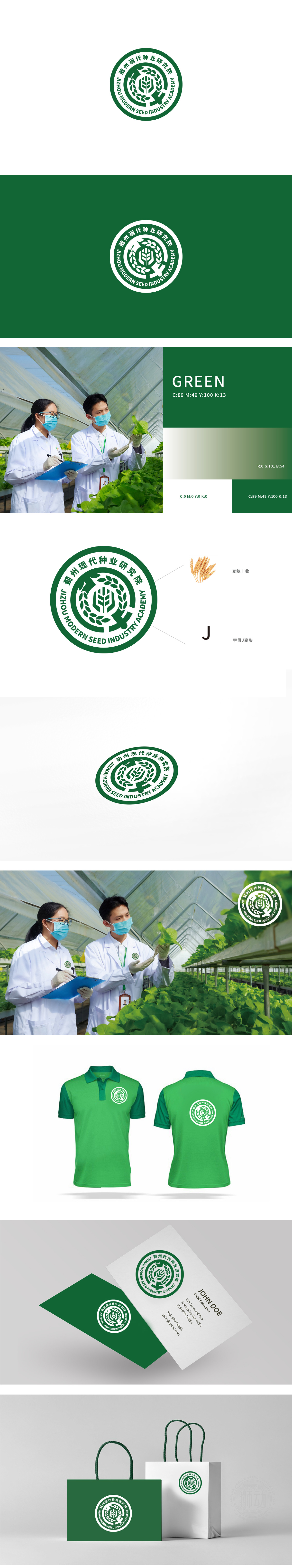
狮动设计以抽象化的麦穗图形为视觉焦点,麦芒线条挺拔向上,既符合种业“育种、高产”的核心使命,又通过对称结构传递稳定感。外层环绕的橄榄枝纹样,既象征农业与自然的联结,又以环形闭合结构强化“守护、孕育”的概念,与研究院“推动种业发展”的定位高度契合。巧妙融入“蓟州”首字母“J”的形态,使图形在具象与抽象(地域标识)之间形成双重解读,整体设计采用正圆形作为外框,既符合“印章”的权威感,又通过环形的“循环、延续”意象,隐喻种业“育种-生长-收获-再育种”的产业闭环,以及农业科技的可持续发展理念。
Lion design takes the abstract wheat ear figure as the visual focus, and the wheat awn lines are straight and upward, which not only conforms to the core mission of seed industry "breeding and high yield", but also conveys a sense of stability through symmetrical structure. The olive branch pattern surrounded by the outer layer not only symbolizes the connection between agriculture and nature, but also strengthens the concept of "guarding and nurturing" with a ring-shaped closed structure, which is highly consistent with the positioning of the research institute of "promoting the development of seed industry".


扫码或拨打添加客服微信


