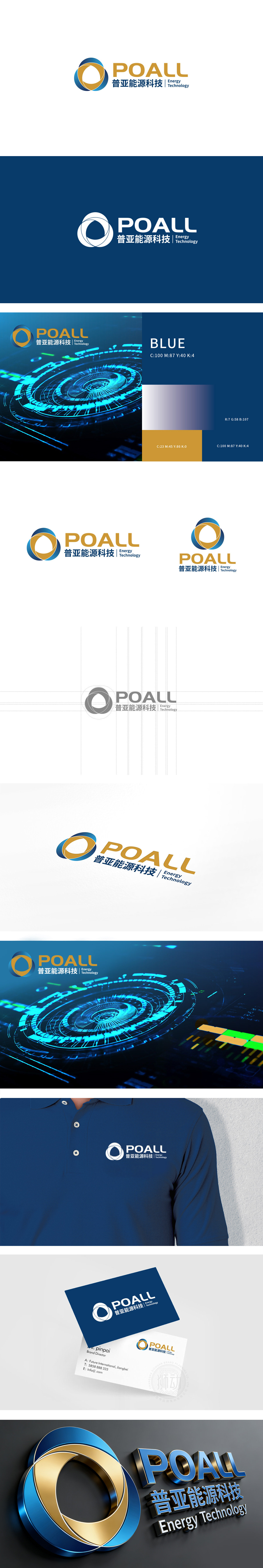
狮动设计由三个交织的环形(蓝、金两色叠加),形成「无限循环」的视觉效果,同时交织的结构又传递「连接、整合」的含义——既像能源的流动(如电流、水流),也像企业与客户、合作伙伴的紧密关联。中文「普亚能源科技」用稳重的 字体,搭配深蓝色,突出能源行业的「可靠感」;整体LOGO既符合能源科技行业的「严谨感」,又传递出企业的「创新与活力」,是「形式追随功能」的优秀案例。
Lion design consists of three intertwined rings (blue and gold colors superimposed), which form the visual effect of "infinite cycle", and at the same time, the intertwined structure conveys the meaning of "connection and integration"-not only like the flow of energy (such as current and water flow), but also like the close relationship between enterprises and customers and partners. Chinese "Puya Energy Technology" uses steady fonts and dark blue to highlight the "reliability" of the energy industry; The overall LOGO not only conforms to the "rigor" of the energy technology industry.


扫码或拨打添加客服微信


