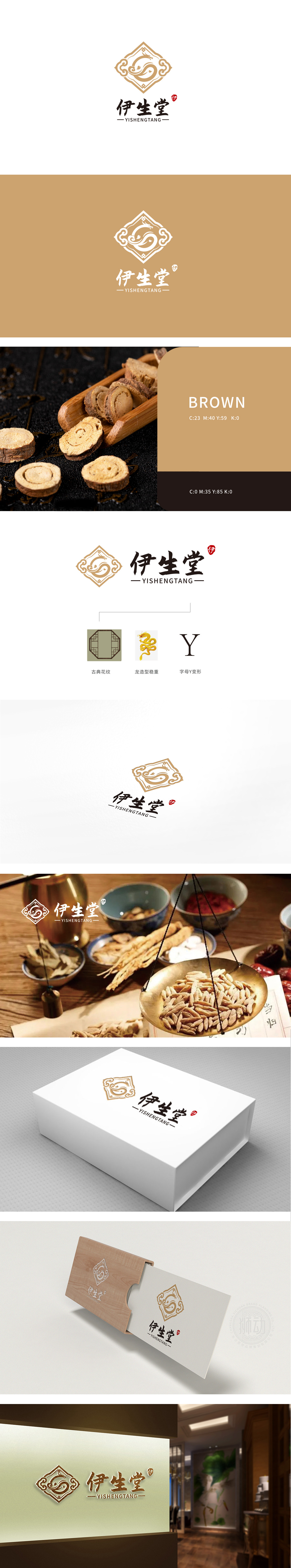
狮动设计以古典纹样与框架:传递“传承感”与“信赖感”,八角形轮廓自带对称均衡的视觉稳重感,绿色底色搭配金色线条,既呼应了传统工艺的雅致,又暗合保健品“自然、草本、养生”的核心属性,传递出品牌“源自传统、扎根经典”的专业形象。龙造型:赋予“权威感”与“生命力”,字母“Y”变形:品牌基因的视觉锚点,,为品牌注入现代简洁的识别符号,形成“传统内核+现代外延”的双重识别体系。整体构成“外方内圆”(框架方正、龙纹圆转)的视觉平衡,暗合中国传统文化“刚柔并济”的哲学,也隐喻保健品“调理平衡、内外兼修”的功能诉求。
Lion Design with Classical Patterns and Frames: Transmitting "Sense of Inheritance" and "Sense of Trust"The octagonal outline has a symmetrical and balanced sense of visual stability, and the green background with golden lines not only echoes the elegance of traditional crafts, but also coincides with the core attributes of health care products, which conveys the professional image of the brand "from tradition and rooted in classics".Dragon modeling: giving "authority" and "vitality", the letter "Y" deformation: the visual anchor point of brand genes, injecting modern and concise identification symbols into the brand, forming a dual identification system of "traditional core+modern extension".


扫码或拨打添加客服微信


