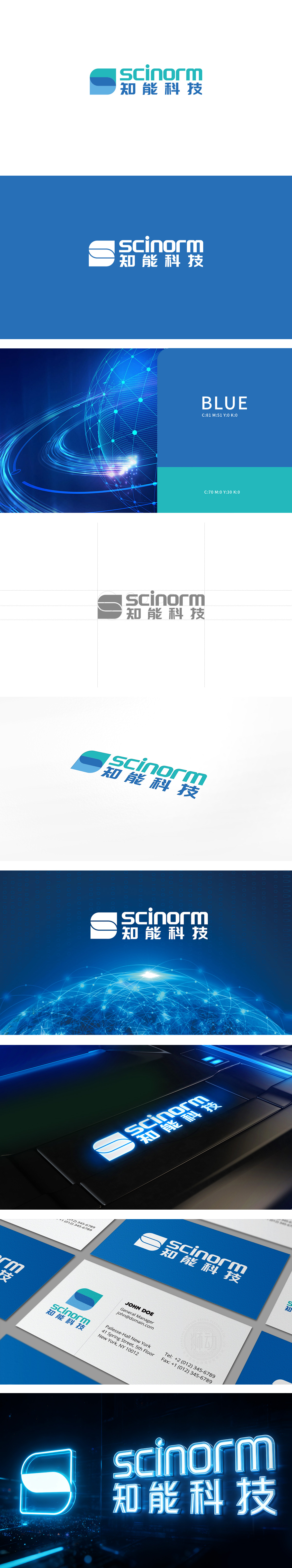
狮动设计以简洁几何中的科技感与包容性,“分层圆弧”设计打破了传统科技品牌的锐利线条,通过柔和的曲线传递包容、开放的品牌性格,同时叠加结构暗示“叠加创新”“技术融合”的概念。采用蓝绿色系,浅蓝绿象征前沿、智能、活力,深蓝象征专业、可靠、深度,两者自然过渡无生硬边界,符合“知能”(智能+知识)的融合定位,。通过 “抽象图形隐喻核心价值”“色彩与字体强化行业属性”“细节呼应提升整体统一” 的设计逻辑,成功实现了“科技感”“专业度”“包容性”的品牌形象传递。
Lion Design has a sense of science and technology and inclusiveness in concise geometry. The "layered arc" design breaks the sharp lines of traditional science and technology brands, conveys inclusive and open brand personality through soft curves, and at the same time, the overlapping structure implies the concepts of "overlapping innovation" and "technology integration". The blue-green system is adopted, with light blue-green symbolizing cutting edge, intelligence and vitality, and deep blue symbolizing professionalism, reliability and depth.


扫码或拨打添加客服微信


