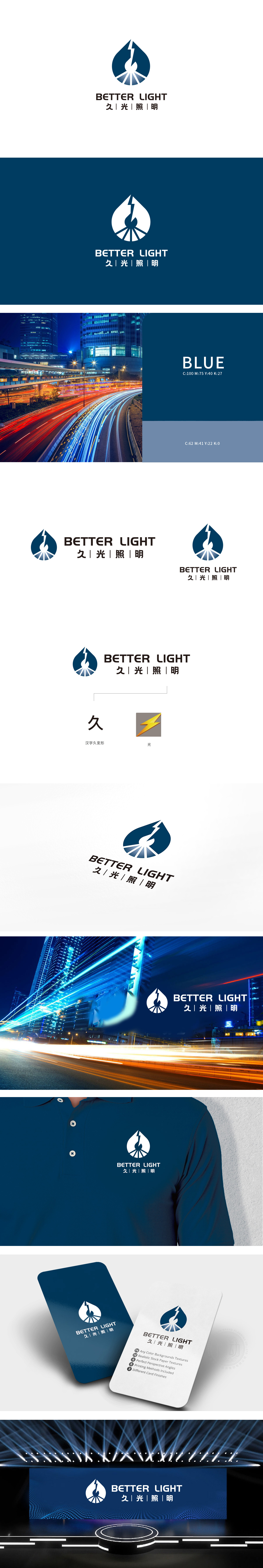
狮动设计以水滴轮廓为外框,水滴中心的白色抽象造型酷似“燃烧的火焰”,底部放射状线条模拟光线扩散,直接点明“照明”行业属性,同时通过线条的锐角与放射感传递能量感。水滴形态既呼应“久”字所蕴含的“持久、延续”,赋予科技产品自然亲和力。黄色闪电图形作为“光”的象征,采用高纯度黄色+橙色渐变,搭配尖锐的三角形折线,与上方水滴的圆润形成刚柔对比,既象征电能转化为光能的过程,也通过色彩与形态的强识别性降低记忆成本。整体通过“自然意象+科技符号+文化元素”的三重嫁接**,既满足了照明行业对“光源、能量、可靠”的功能属性传达,又通过水滴、书法字等元素赋予品牌人文温度与记忆点。
Lion design takes the outline of a water drop as the outer frame, the white abstract shape in the center of the water drop resembles a "burning flame", and the radial lines at the bottom simulate the light diffusion, directly pointing out the industrial attribute of "lighting", and at the same time transmitting the energy sense through the acute angle and radiation sense of the lines. The shape of water droplets not only echoes the "permanence and continuity" implied by the word "long", but also endows scientific and technological products with natural affinity. As a symbol of "light", the yellow lightning pattern adopts a high-purity yellow+orange gradient with sharp triangular broken lines.


扫码或拨打添加客服微信


