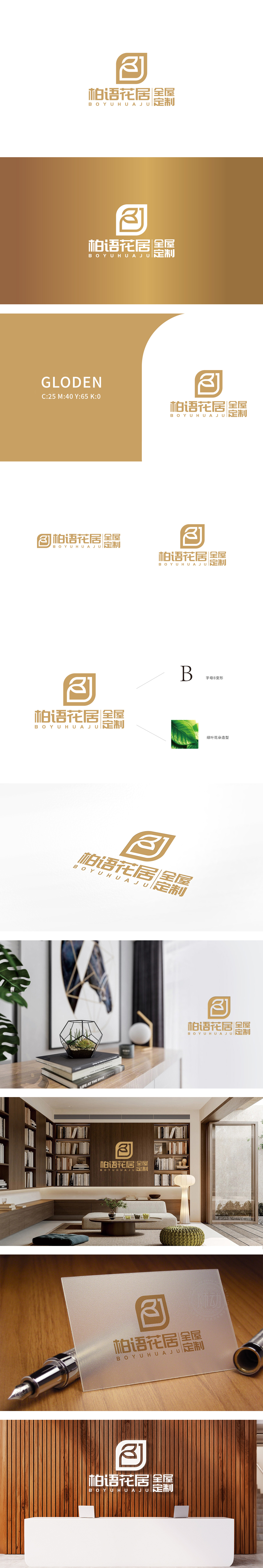
狮动设计采用两个对称的“B”形曲线(抽象化的“花”形轮廓)构成,既呼应品牌名称首字“柏(Bǎi)”的首字母“B”,又通过曲线的柔美形态暗合“花居”的自然、雅致意境,同时双“B”对称结构传递平衡、和谐的视觉感受,贴合家居产品对“对称美”“秩序感”的追求。金色通常关联“高端”“品质”,符合全屋定制中高端市场的定位;同时低饱和度的处理避免了浮夸感,反而更贴近“柏木”“原木”的自然色泽,传递环保、自然的品牌理念。整体通过简洁的视觉语言,将“全屋定制的专业”“花居的自然”“柏木的质感”三者有机融合,堪称“小而美”的品牌视觉符号典范。
Lion design consists of two symmetrical "B" curves (abstract "flower" outline), which not only echoes the initial letter "B" of the brand name "Bai (B ? I)", but also coincides with the natural and elegant artistic conception of "Flower House" through the soft shape of the curves. At the same time, the double "B" symmetrical structure conveys a balanced and harmonious visual experience, which fits the pair of home products. Gold is usually associated with "high-end" and "quality", which is in line with the positioning of the high-end market for whole house customization; At the same time, the treatment of low saturation avoids the sense of exaggeration, but it is closer to the natural color of "cypress" and "log" and conveys the brand concept of environmental protection and nature.


扫码或拨打添加客服微信


