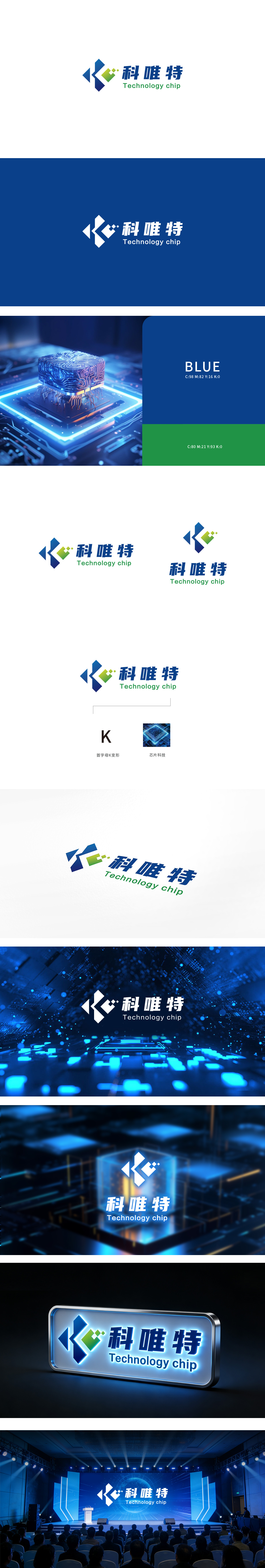
狮动设计以品牌首字母“K”为原型,通过几何切割与色块叠加,形成兼具科技感与动态张力的视觉符号。深蓝色三角形象征“技术基石”,绿色渐变方块与白色点缀构成的“上升箭头”,既呼应“K”的笔画结构,又隐喻“创新突破”与“持续增长”。深蓝色:传递专业、可靠与科技属性,符合芯片行业对精密与稳定性的特质要求;绿色渐变:注入活力与可持续发展理念,暗示技术迭代中的环保意识或高效能目标;“科”(科技)、“唯”(专注)、“特”(独特)三字组合,既点明行业属性,又传递“专注核心技术,打造独特价值”的品牌主张。通过抽象符号与具象行业元素的融合、色彩与形态的理性配比,成功构建了“专业、创新、可靠”的科技品牌形象。
Lion design takes the brand initials "K" as the prototype, and through geometric cutting and color block superposition, it forms a visual symbol with both scientific and technological sense and dynamic tension. The dark blue triangle symbolizes the "technical cornerstone", and the "rising arrow" composed of green gradient squares and white embellishments not only echoes the stroke structure of "K", but also metaphors "innovation breakthrough" and "continuous growth". Dark blue: it conveys professional, reliable and scientific attributes, and meets the special requirements of the chip industry for precision and stability; Green gradient: injecting vitality and sustainable development concept, suggesting environmental awareness or high-efficiency goals in technical iteration.


扫码或拨打添加客服微信


