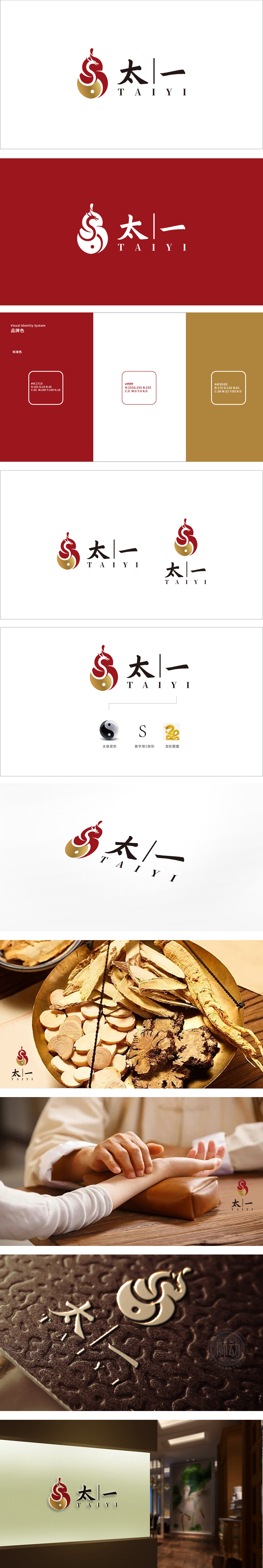
狮动设计采用“太一”与“太极”的本源呼应,太一”二字直接锚定这一哲学根基,而图形中的金色圆点(太极点)正是对“元初之气”的视觉化象征,红金双色弧线构成类似“太极图”的动态平衡结构:暗合中医“阴阳互根、消长平衡”的核心辨证思想。整体通过“龙纹-太极-五行”的符号系统,将中医“一元论”(太一)、“二元论”(阴阳)、“三元论”(精气神)浓缩为极简的视觉语言,既保留了中医文化的厚重底蕴,又通过抽象化、符号化处理赋予其现代品牌的识别性。
Lion design echoes the origin of "Taiyi" and "Taiji", and the word "Taiyi" directly anchors this philosophical foundation, while the golden dots (Taiji points) in the figure are the visual symbols of "Qi at the beginning of Yuan Dynasty", and the red and gold double-color arcs constitute a dynamic balance structure similar to "Taiji diagram", which coincides with the core dialectical thought of "Yin and Yang are mutually rooted and balanced" in traditional Chinese medicine. As a whole, through the symbol system of "Dragon Pattern-Taiji-Five Elements", the monism (Taiyi), dualism (Yin and Yang) and sanyuan (Spirit) of TCM are condensed into a minimalist visual language.


扫码或拨打添加客服微信


