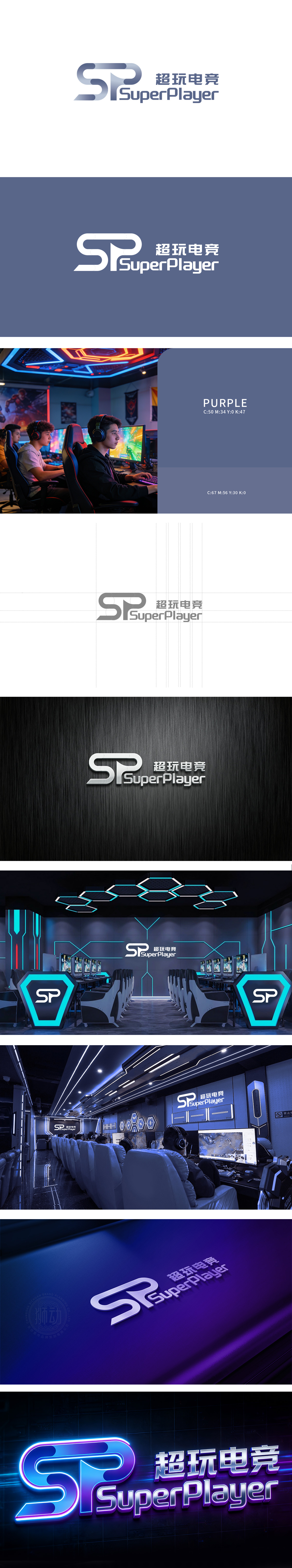
狮动设计以“S”“P”为核心,通过流畅的曲线与渐变切割形成一体化图形:“S”以圆润的波浪线条呈现,既保留了字母识别性,又注入了速度感与动态张力,契合电竞行业的竞技属性;“P”的竖线与“S”的尾部自然衔接,形成“环环相扣”的视觉效果,暗喻“玩家与竞技的深度连接”。字母线条采用深浅渐变的蓝灰色块拼接,隐喻电竞领域的“团队协作”,同时通过色块的明暗对比,让二维图形产生轻微的立体纵深感,细节处体现精致度,传递出专业、冷静、可靠的品牌气质,整体通过字母变形、线条节奏、色彩隐喻**等“软设计语言”传递品牌内核——既满足了电竞用户对“潮酷感”的审美需求,又以简洁、专业的视觉形象建立了品牌可信度。
Lion design takes "S" and "P" as the core, and forms an integrated figure through smooth curves and gradual cutting: "S" is presented with rounded wavy lines, which not only retains the letter recognition, but also injects a sense of speed and dynamic tension, which fits the competitive attributes of e-sports industry; The vertical line of "P" naturally connects with the tail of "S", forming a visual effect of "interlocking", which is a metaphor for "deep connection between players and competition". The letter lines are spliced with gradually changing blue-gray blocks, which symbolizes the "teamwork" in the field of e-sports. At the same time.


扫码或拨打添加客服微信


