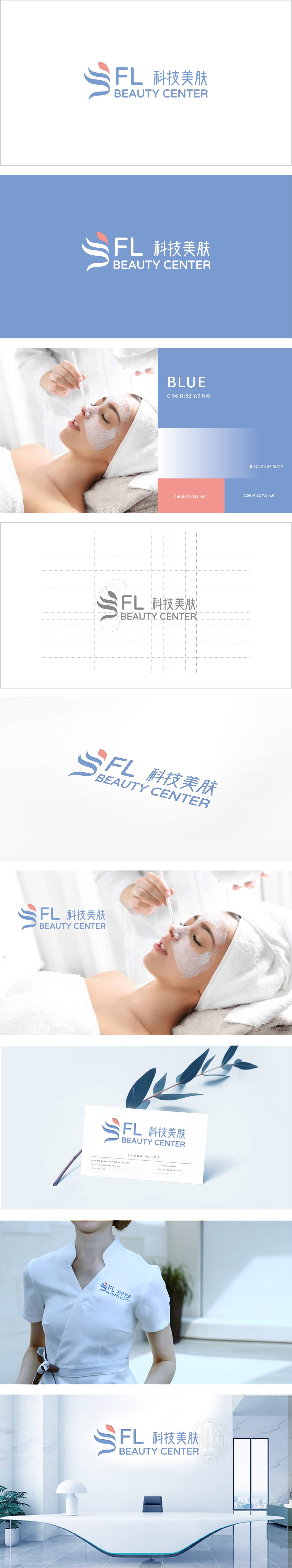
狮动设计采用飘逸的曲线组成,形似流动的丝带或简化的“美”字形态,寓意肌肤的顺滑、活力,也象征科技带来的“焕新”效果。 粉色曲线与下方两条蓝色曲线形成对比,既突出视觉焦点,也暗示“科技(蓝)与美学(粉)的结合”。通过简洁的图形、精准的色彩和明确的文字,成功传递了“科技驱动的专业美肤服务”定位,既体现了品牌的技术属性,又不失亲和力。
Lion design consists of elegant curves, which are like flowing ribbons or simplified "beauty" shapes, implying the smoothness and vitality of the skin, and also symbolizing the "rejuvenation" effect brought by technology. The pink curve contrasts with the two blue curves below, which not only highlights the visual focus, but also implies the combination of technology (blue) and aesthetics (pink). Through concise graphics, accurate colors and clear words, the positioning of "technology-driven professional skin care service" has been successfully conveyed.


扫码或拨打添加客服微信


