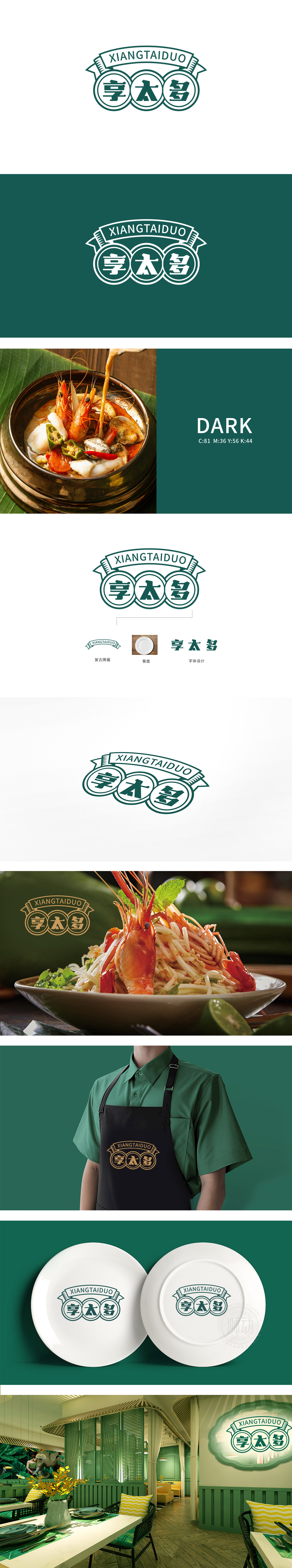
狮动设计采用双线条勾勒,内部填充饱满的“享”“太”“多”三字,形成类似传统印章的视觉印象。圆形在视觉上传递完整、包容的意象,三圆串联则暗合“多”的概念,与品牌名“太多”形成呼应。细节:圆环的双线设计增加层次感,内圆与外圆的间距适中,既保证文字的可读性,又强化了图形的立体感,避免单薄。墨绿色的经典与信任感,暗示“品质、健康”的产品定位,“享太多”传递的“享受丰盛”“品质生活”理念高度契合。以传统印章为骨架,用现代设计语言(简化字体、单色系统、几何结构)打破陈旧感,同时通过色彩、符号隐喻精准传递品牌核心——“享受”与“丰盛”。
Lion design is outlined by double lines, and filled with the words "enjoy", "too" and "many", forming a visual impression similar to the traditional seal. The circle visually conveys a complete and inclusive image, while the series connection of three circles coincides with the concept of "many" and echoes the brand name "too much".Details: The double-line design of the ring increases the sense of hierarchy, and the spacing between the inner circle and the outer circle is moderate, which not only ensures the readability of the text, but also strengthens the three-dimensional sense of the figure and avoids thinness.


扫码或拨打添加客服微信


