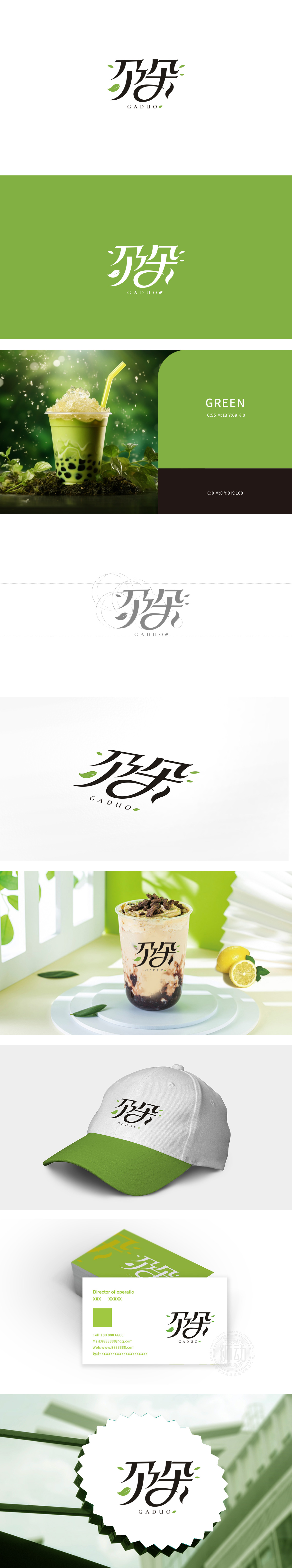
狮动设计通过书法化变形,笔画间融入了流畅的曲线与舒展的笔触,“朵”字的圆弧形结构既像奶茶杯沿的柔和轮廓,又暗合“花朵”的意象,传递出饮品的精致感与自然属性。散落的绿色叶片是最直接的品类暗示,明确指向“茶”这一核心原料,同时绿色传递出健康、清新的品牌调性,与奶茶行业常见的“天然、新鲜”定位高度契合。叶片的不规则分布打破了文字的静态感,增添了自然活力,也隐喻了饮品原料的丰富层次。该标识通过汉字的意象化变形、叶片的品类符号、简约的排版美学,成功在视觉上构建了“茶饮”的核心认知,同时“朵”字的柔美形态与叶片的灵动性,又赋予品牌亲切、细腻的情感温度,符合奶茶消费群体对“品质”与“体验”的双重需求。
Lion design adopts calligraphic deformation, and the smooth curves and stretching strokes are integrated between the strokes. The circular arc structure of the word "flower" is not only like the soft outline of the edge of the milk tea cup, but also coincides with the image of "flower", conveying the exquisite feeling and natural attributes of the drink. Scattered green leaves are the most direct category suggestion, which clearly points to the core raw material of "tea". At the same time, green conveys a healthy and fresh brand tonality, which is highly consistent with the common "natural and fresh" positioning in the milk tea industry. The irregular distribution of leaves breaks the static sense of words, adds natural vitality, and also implies the rich level of beverage raw materials.


扫码或拨打添加客服微信


