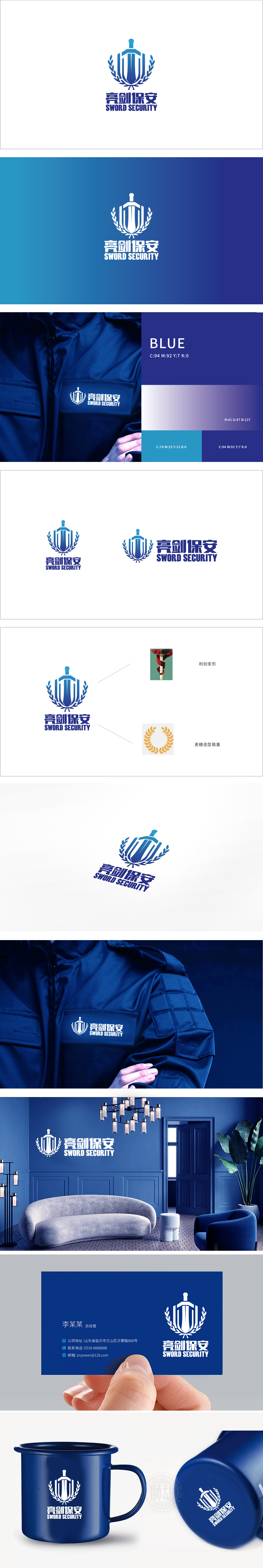
狮动设计以 “剑” 为核心视觉符号,剑身直立挺拔,线条硬朗,象征安保行业的“守护、力量、权威”;剑的两侧巧妙融入了 盾牌轮廓,盾牌是经典的安全象征,二者叠加既突出“亮剑”的主动性,又强化“保安”的防御属性,形成“主动出击+坚实守护”的双重内涵,橄榄枝环绕,传递“安全与和平”理念,蓝色主调,塑造“专业、可靠、信任”的品牌形象。整体设计通过“剑(行动)+ 盾牌(守护)+ 橄榄枝(和平)”的组合,精准传递了“亮剑保安”的核心价值:既有“敢于担当、主动作为”的“亮剑精神”,又有“专业规范、守护安宁”的保安职责。
Lion design takes "sword" as the core visual symbol, with upright body and tough lines, which symbolizes the "guard, strength and authority" of the security industry; The sides of the sword are ingeniously integrated with the outline of the shield, which is a classic symbol of security. The superposition of the two not only highlights the initiative of "bright sword", but also strengthens the defensive attribute of "security", forming the dual connotation of "active attack+solid protection", surrounded by olive branches, conveying the concept of "security and peace" and the blue theme, shaping the brand image of "professionalism, reliability and trust".


扫码或拨打添加客服微信


