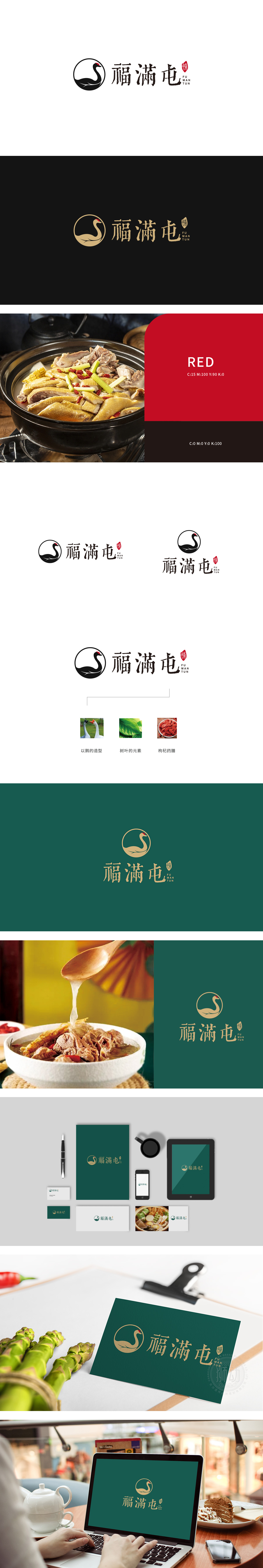
狮动设计以“鹅”为视觉锚点,锁定品类认知。天鹅造型以极简线条勾勒,黑白色调经典大气,昂首向上的姿态传递出品牌的品质感。。绿叶图形传递出自然、新鲜、健康的餐饮理念,暗示食材的原生态,贴合当下消费者对“绿色饮食”的追求。整体通过动物、自然元素、文化文字的有机融合,既满足了餐饮行业“直观、易识别”的传播需求,又赋予品牌情感温度与文化深度。
Lion design takes "goose" as the visual anchor and locks in category cognition. The swan shape is outlined with minimalist lines, the black and white tones are classic and atmospheric, and the attitude of holding your head high conveys the brand's sense of quality.. Green leaf graphics convey a natural, fresh and healthy catering concept, suggesting the original ecology of ingredients, which is in line with consumers' pursuit of "green diet". Through the organic integration of animals.


扫码或拨打添加客服微信


