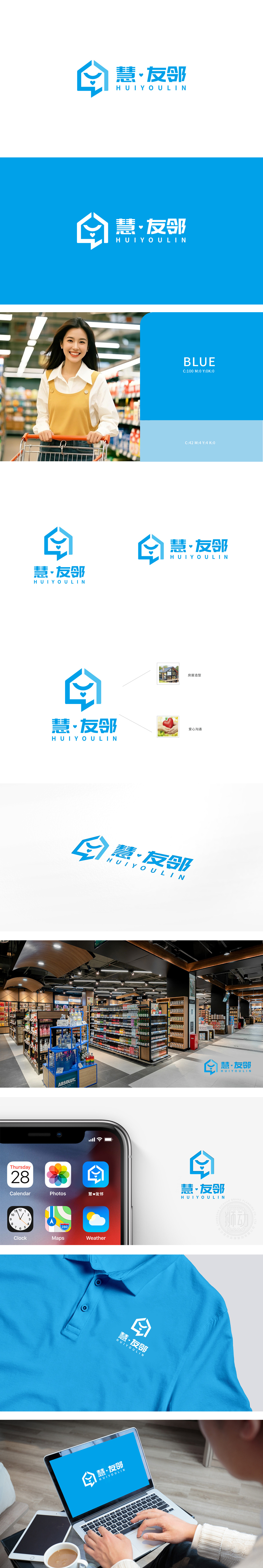
狮动设计以蓝色房屋轮廓为基础,屋顶与墙体线条自然构成“对话气泡”的形态,既直观呼应“社区邻里”的居住场景,又通过气泡形态隐喻“沟通”“连接”的核心功能,将“家”与“交流”两个关键概念无缝衔接,图形极简却信息密度高。通过心形符号具象化“关爱”“互助”的邻里关系,整体用极简图形承载了“空间+人+情感”的三重关系,既通过房屋造型锚定行业属性,又通过对话气泡与爱心符号赋予品牌人格化温度,整体逻辑清晰、记忆点突出,展现了对“社区服务”核心价值(便捷、信任、温暖)的精准提炼。
Lion Design is based on the outline of a blue house, and the roof and wall lines naturally form a "dialogue bubble" shape, which not only intuitively echoes the living scene of "community neighborhood", but also metaphorically connects the two key concepts of "home" and "communication" through the bubble shape, with minimal graphics and high information density. Through the heart-shaped symbol, the neighborhood relationship of "caring" and "helping each other" is symbolized, and the triple relationship of "space+people+emotion" is carried by the overall minimalist graphics.


扫码或拨打添加客服微信


