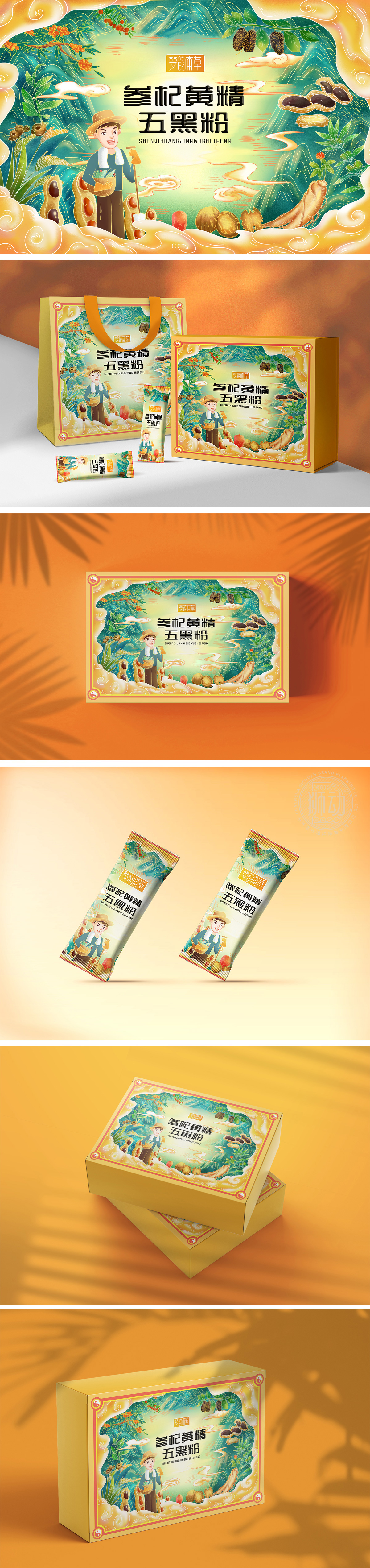
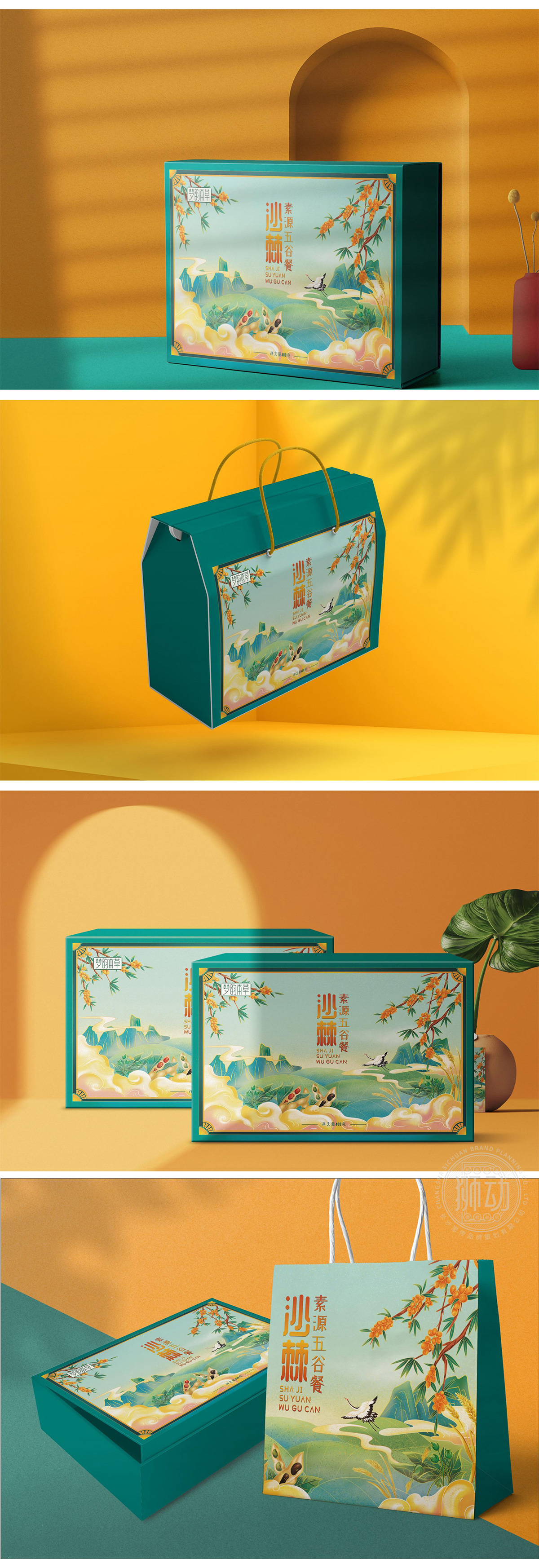
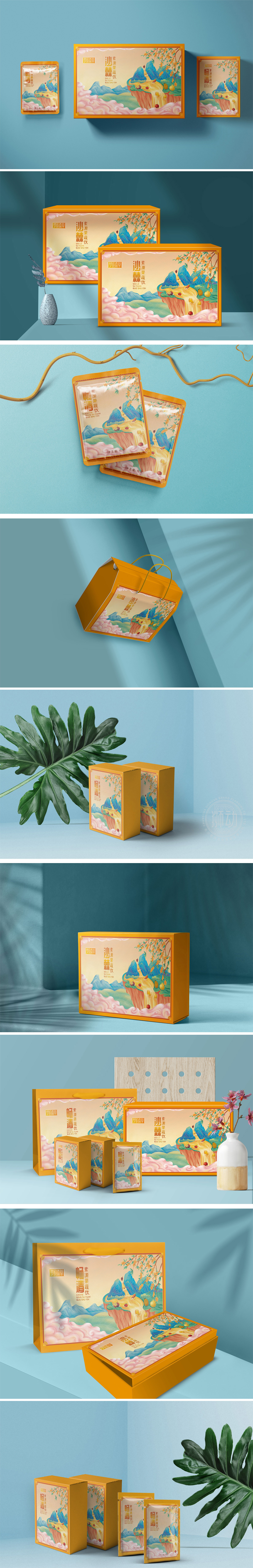
狮动设计以“田园劳作”为主题,手绘风格的农夫形象手持农具、满载食材,周围环绕着写实与写意结合的原材料插画(枸杞、红枣、谷物等),直观传递“药食同源”“自然采摘”的产品属性,强化“天然、健康、地道”的信任感。人物表情亲切,服饰朴素,配合远山、祥云、浪花等传统纹样,构建出“原生态田园”的场景联想,贴合滋补品的传统认知,主色调:以暖黄色为基底(象征土地、温暖、传统),搭配青绿(植物)、赭石(谷物)、深棕(五黑食材),色彩层次丰富且统一,既符合“养生滋补”的沉稳调性,又通过明亮的色块对比)增强视觉活力,避免沉闷。包装的成功在于“以情动人,以景传实”:用手绘场景代替冰冷的成分列表,用传统符号传递文化认同,用明快色彩平衡养生品的厚重感。
Lion Design takes "farm work" as the theme, and the hand-painted farmer image holds farm tools and is full of ingredients, surrounded by illustrations of raw materials (Lycium barbarum, red dates, grains, etc.) that combine realism and freehand brushwork, intuitively conveying the product attributes of "homology of medicine and food" and "natural picking", and strengthening the trust of "natural, healthy and authentic". The characters have friendly expressions and simple costumes. With traditional patterns such as distant mountains, auspicious clouds and waves, the scene association of "original ecological countryside" is constructed, which conforms to the traditional cognition of tonics.


扫码或拨打添加客服微信


